
Neumorphism Hover Effect on Social Media Icons CSS | Neumorphism Hover Animation
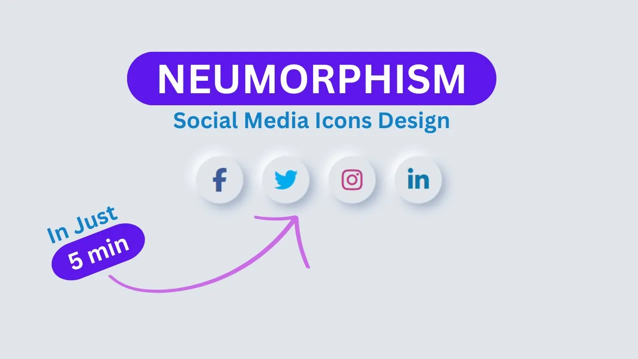
Neumorphism Hover Effect on Social Media Icons CSS | Neumorphism Hover Animation | TheProviders
In this tutorial, you’ll learn how to create stylish social media icons with a Neumorphism hover effect using just HTML and CSS. Neumorphism (or soft UI) is a modern design trend that gives elements a soft, 3D look with smooth shadows, making the design elegant and minimalistic.
We’ll walk through how to design Neumorphism-style social media buttons that glow and animate beautifully when hovered over. This project is especially great for beginners who want to practice UI/UX design concepts with simple HTML and CSS.
Features of the Neumorphism Social Icons
-
Created using only HTML & CSS
-
Neumorphism design with soft shadows and depth
-
Smooth hover animation effects
-
Fully responsive and modern look
-
Beginner-friendly project to practice CSS skills
What You’ll Learn
-
How to design social media icons using HTML structure
-
How to apply Neumorphism effects with CSS shadows
-
How to create hover animations for interactive design
-
How to style and customize icons for any project
By the end of this tutorial, you’ll be able to create your own Neumorphism-inspired social media buttons with hover animations that give your website a clean, modern, and professional look.
Start HTML:
                                <!DOCTYPE html>
<html lang="en">
<head>
    <meta charset="UTF-8">
    <meta name="viewport" content="width=device-width, initial-scale=1.0">
    <title>Neumorphism Social Icons</title>
<link rel="stylesheet" href="https://cdnjs.cloudflare.com/ajax/libs/font-awesome/7.0.0/css/all.min.css" />
</head>
<body>

        <div class="icon-container">
            <a href="#" class="icon-link facebook">
                <i class="fab fa-facebook-f"></i>
            </a>
            <a href="#" class="icon-link twitter">
                <i class="fab fa-twitter"></i>
            </a>
            <a href="#" class="icon-link instagram">
                <i class="fab fa-instagram"></i>
            </a>
            <a href="#" class="icon-link linkedin">
                <i class="fab fa-linkedin-in"></i>
            </a>
        </div>

</body>
</html>
Let's write CSS and make it Awesome Neumorphism Icons.
                                <style>

        :root{
            --bg-color: #e0e5ec;
            --main-color: #3f4e6d;
            --shadow-light: #ffffff;
            --shadow-dark: #a3b1c6;
        }
        body{
            background-color: var(--bg-color);
            display: flex;
            justify-content: center;
            align-items: center;
            min-height: 100vh;
            margin: 0;
        }
        .icon-container{
            display: flex;
            gap: 2rem;
        }
        .icon-link{
            width: 80px;
            height: 80px;
            display: flex;
            justify-content: center;
            align-items: center;
            background-color: var(--bg-color);
            border-radius: 50%;
            text-decoration: none;
            color: var(--main-color);
            font-size: 2.5rem;
            box-shadow: 8px 8px 16px var(--shadow-dark) , -8px -8px 16px var(--shadow-light);
            transition: all 0.3s ease-in-out;
        }
        .icon-link:hover{
            box-shadow: inset 6px 6px 12px var(--shadow-dark) , inset -6px -6px 12px var(--shadow-light);
            transform: scale(0.95);
        }
        .icon-link.facebook i{ color : #3b5998}
        .icon-link.twitter i{ color : #00acee}
        .icon-link.instagram i{ color : #C13584}
        .icon-link.linkedin i{ color : #0e76a8}

</style>
Recent Post

Most Popular Post

Categories
- HTML & CSS9
- Bootstrap4
- Login Forms11
- Sidebar Menu1
- Card Design1
- CSS Buttons3
- Social Media Buttons1
- Preloader or Loaders5
- Neumorphism Designs3
- Contact Forms6
- Responsive Footers8
- Javascript4
- Websites3
- Bootstrap Cards0
- Vanilla JavaScript1
- jQuery Effects0
- Bootstrap Sidebar Menus0
- CSS Sidebar Menus0
- Navigation Bars4
- Responsive Gallery3
- Responsive Feedback Page5
- Blog0