
How to Create Animated Cooling Fan in Html and CSS 2020 | CSS Cooling Fan
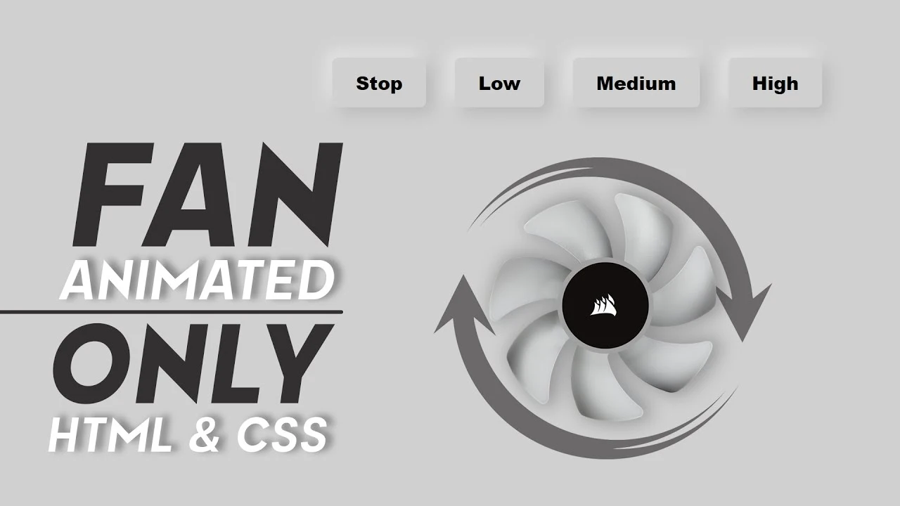
In this CSS Animated Tutorial, I will Create Animated Cooling Fan in Html and CSS only
Download Code Files
How to Create Animated Cooling Fan in Html and CSS 2020 | CSS Cooling Fan | CSS Animation Tutorials
In this CSS Animated Tutorial, I will Create Animated Cooling Fan in Html and CSS only | Animated Cooling Fan in only CSS 2020 | CSS Animation tutorial 2020. This tutorial is very useful for CSS Professionals Designers. Number four-stop is not a stop its is high
HTML
                                <!DOCTYPE html>
<html>

<head>
  <title>Neumorphism Design Cooling Fan</title>
</head>

<body>
  <div class="container">
    <br><br>
    <form style="margin-top: 30px;">
      <input type="radio" id="stop" name="fan">
      <label for="stop" id="stop_active">Stop</label>

      <input type="radio" id="low" name="fan">
      <label for="low" id="low_active">Low</label>

      <input type="radio" id="second" name="fan">
      <label for="second" id="mdm_active">Medium</label>

      <input type="radio" id="third" name="fan">
      <label for="third" id="high_active">High</label>

      <div class="svg">
        <img class="wings"
          src="https://www.freepnglogos.com/uploads/fan-png/fan-svg-png-icon-download-onlinewebfontsm-31.png" alt="Fan">

      </div>
    </form>

  </div>
</body>
</html>
CSS
                                body {
    font-family: "Poppins", sans-serif;
    background: #cfd0d0;
  }

  .container {
    width: 100%;
    text-align: center;
  }

  .svg {
    width: 90%;
    margin: 0 auto;
    overflow: hidden;
    margin-top: 40px;
  }

  img {
    width: 450px;
    height: 450px;
  }

  input[type=radio] {
    width: 20px;
    height: 20px;
    cursor: pointer;
    margin-left: 10px;
    display: none;
  }

  label {
    padding: 10px 20px;
    border-radius: 5px;
    font-weight: 900;
    margin-left: 20px;
    cursor: pointer;
    box-shadow: 5px 5px 13px #b6b7b7, -5px -5px 13px #e8e9e9;
  }

  label:hover {
    box-shadow: inset 5px 5px 13px #b6b7b7, -5px -5px 13px #e8e9e9;
  }

  .wings {
    animation-iteration-count: infinite;
    animation-timing-function: linear;
  }

  #stop:checked~.svg>.wings {
    transform: rotate(0);
  }

  #low:checked~.svg>.wings {
    animation-name: slow;
    animation-duration: 1s;
  }

  @keyframes slow {
    100% {
      transform: rotate(360deg);
    }
  }

  #second:checked~.svg>.wings {
    animation-name: mdm;
    animation-duration: .5s;
  }

  @keyframes mdm {
    100% {
      transform: rotate(360deg);
    }
  }

  #third:checked~.svg>.wings {
    animation-name: fast;
    animation-duration: .1s;
  }

  @keyframes fast {
    100% {
      transform: rotate(360deg);
    }
  }
Conclusion