
Toggle Button with HTML & CSS Change to Close on Hover | Animated Toggle Button
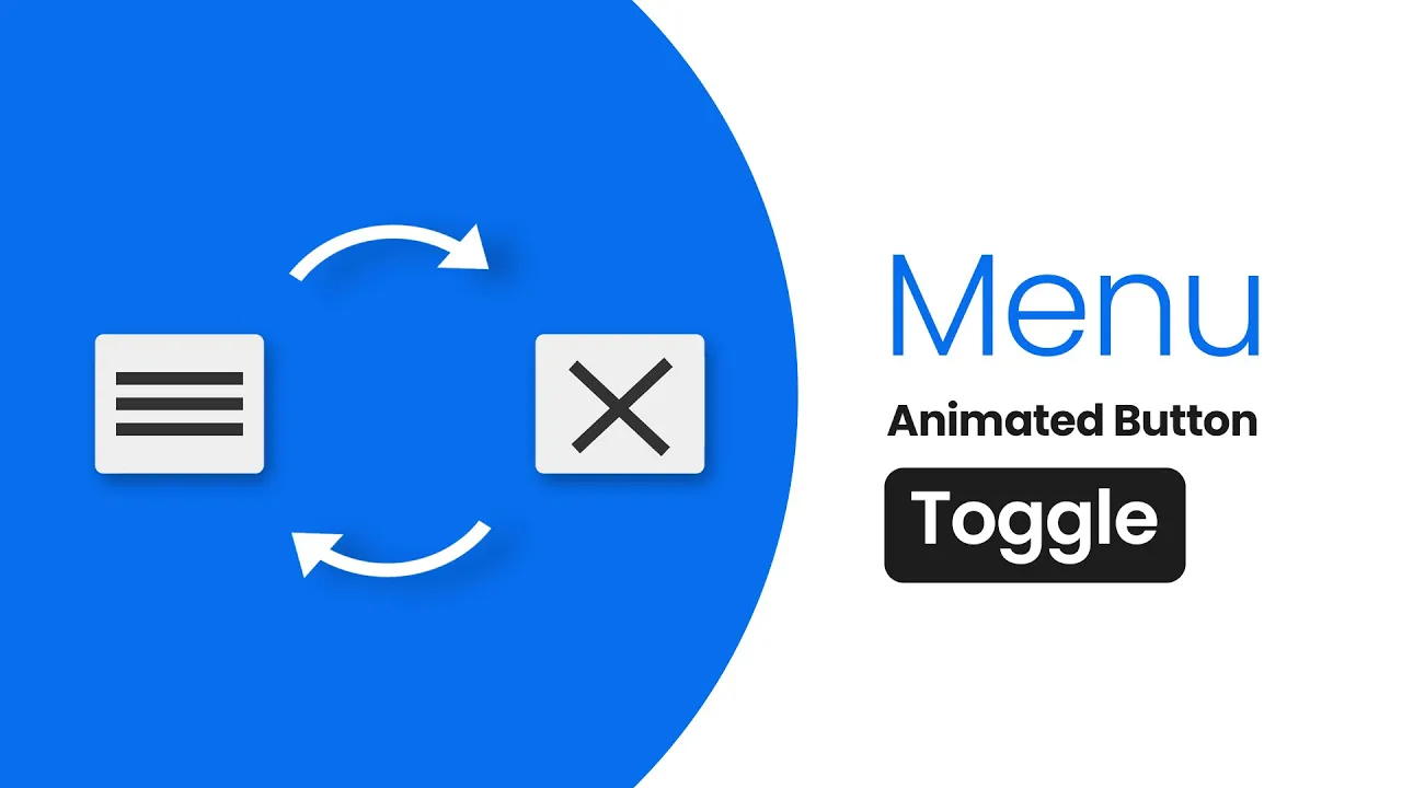
Toggle Button with HTML & CSS
Let’s Build Toggle Button That Transforms:
You’ve probably noticed toggle buttons on websites, but have you ever thought about making one that changes to close button on hover? If you’re a beginner in web development, this is the perfect project to level up your HTML & CSS skills!
In this tutorial, I’ll walk you through creating a toggle button that transforms when you hover over it. We’ll start with a simple HTML structure and then apply CSS magic to add that smooth effect. No JavaScript needed—just pure HTML & CSS!
We’ll use common HTML elements like <div>, along with CSS transitions and shadows to make the effect clean and modern. This is an easy-to-follow project, and by the end, you’ll have a sleek, interactive close button that looks straight out of a pro UI design.
Let’s dive in and bring your web design skills to the next level! #CSS #WebDesign
Steps to Create a Toggle Button Chnage To Close Button with Hover Effect:
Build a sleek and interactive toggle button using just HTML & CSS. Follow these simple steps to create a Toggle Button that transforms on hover
- Create a project folder and name it something like
close-button. Inside, create the necessary files. - Create an
button.htmlfile – This will contain the structure of your button. - Create a
style.cssfile – This will handle the styling and hover effects.
Now, let's code! Add the following HTML codes to your button.html file: This code includes essential HTML markup with different semantic tags like <div> to create the login form layout.
Let’s get started and make your UI look modern & interactive!
                                <!DOCTYPE html>
<!-- Source Codes By TheProviders - theproviders.tech -->
<html>
<head>
	<title>Toggle Button on hover</title>
	<link rel="stylesheet" type="text/css" href="style.css">
</head>
<body>
       <div class="container">
			<div class="toogle-icon" >
					<div class="bar1"></div>
					<div class="bar2"></div>
				 	<div class="bar3"></div>
				</div>
		</div>
</body>
</html>
Now next step, add the following CSS codes to your style.css file to style your Toggle button. Work with different CSS properties such as colors, fonts, box shadows, transitions, oppacity, hover effects and backgrounds to make your form more attractive.
                                body{
         background: linear-gradient(48deg, rgba(78,114,196,1) 15%, rgba(48,107,151,1) 37%, rgba(37,97,148,1) 60%, rgba(21,56,112,1) 87%);
}
	.container
{		position: absolute;
		top: 40%;
		left: 43%;
	}
	.toogle-icon{
		position: absolute;
		background-color: #eee;
		color: #000;
		margin-top: 7px;
		padding: 12px 10px;
		border-radius: 4px;
		cursor: pointer;
		z-index: 1;
		transition: all 0.5s ease;
	}
    .toogle-icon:hover{
        box-shadow: 0px 0px 76px -14px rgba(0,0,0,0.75);
    }
	.bar1, .bar2, .bar3 {
		width: 60px;
		height: 6px;
		background-color: #333;
		margin: 6px 0;
		transition: 0.5s;
	}
	.toogle-icon:hover .bar1 {
	    transform: rotate(-223deg) translate(8px, -10px);
	    transition-delay: .1s;
	}
	.toogle-icon:hover .bar2 {
	    opacity: 0;
	    transition-delay: .1s;
	}
	.toogle-icon:hover .bar3 {
	    transform: rotate(223deg) translate(7px, 7px);
	    transition-delay: .1s;
	}
Finally! Your Toggle Button is Ready! If you’ve followed the steps correctly, your Toggle Button is now live! Open the `buttton.html` file in your browser and see the smooth hover transformation in action.
Conclusion and Final Thoughts:
Creating a toggle button which close with a hover effect is a great way to practice HTML & CSS while exploring the Neumorphism UI trend. By following this guide, you’ve successfully built an interactive and stylish close button without using JavaScript! If you run into any issues, feel free to download the source code to see it in action. Keep experimenting, keep learning, and happy coding!
Recent Post

Most Popular Post

Categories
- HTML & CSS9
- Bootstrap4
- Login Forms11
- Sidebar Menu1
- Card Design1
- CSS Buttons3
- Social Media Buttons1
- Preloader or Loaders5
- Neumorphism Designs3
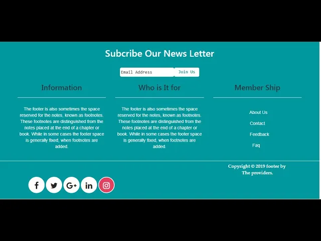
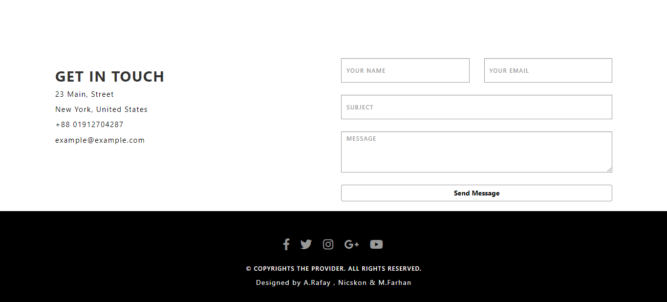
- Contact Forms6
- Responsive Footers8
- Javascript4
- Websites3
- Bootstrap Cards0
- Vanilla JavaScript1
- jQuery Effects0
- Bootstrap Sidebar Menus0
- CSS Sidebar Menus0
- Navigation Bars4
- Responsive Gallery3
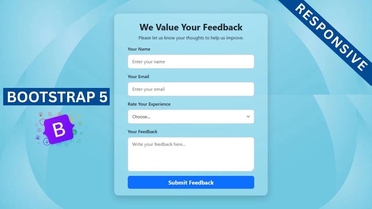
- Responsive Feedback Page5
- Blog0