
Bootstrap 5 About Us Page Design | Responsive About Us Page From Scratch
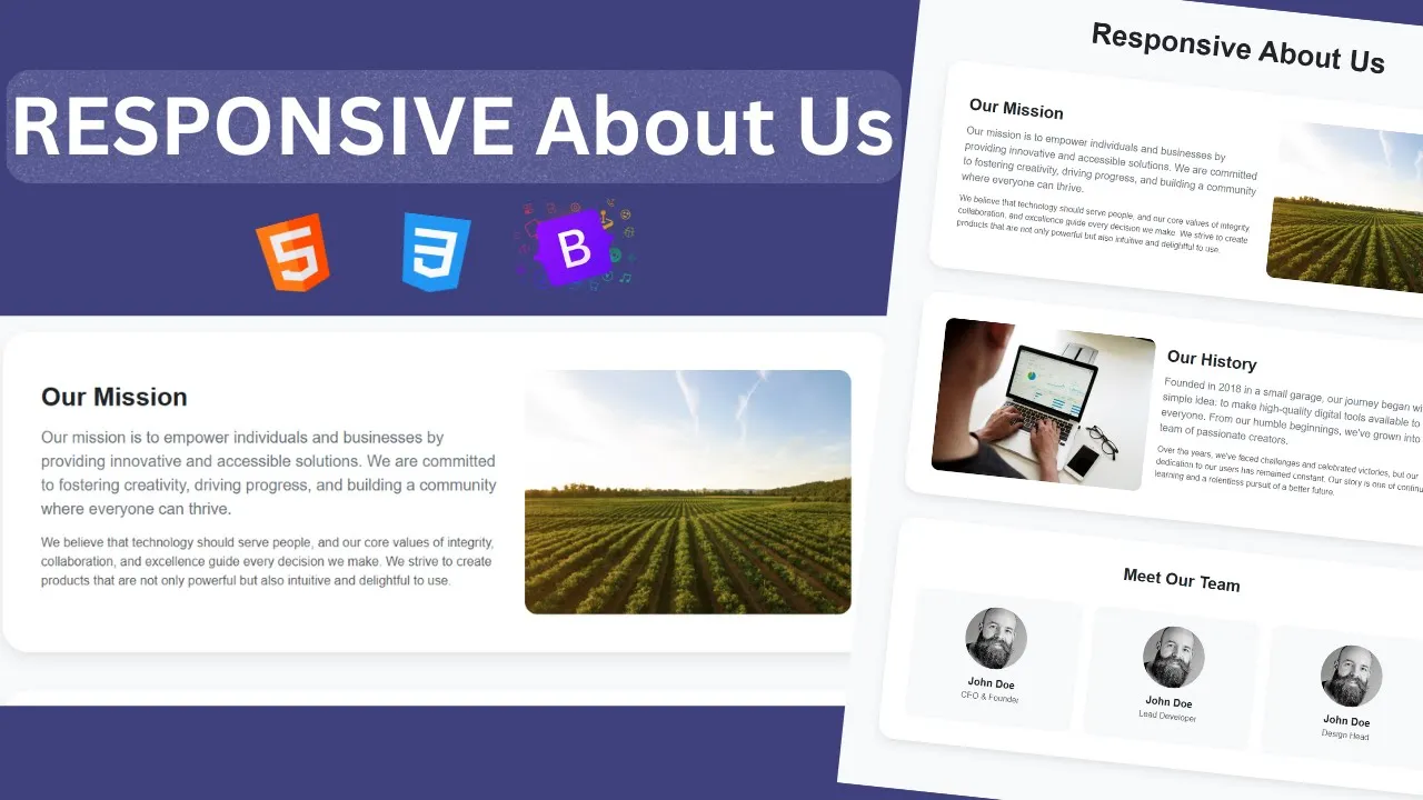
Bootstrap 5 About Us Page Design | Responsive About Us Page | From Scratch
In this tutorial, you’ll learn how to design and build a responsive About Us page using Bootstrap 5 from scratch. The About Us page is one of the most important sections of a website—it tells your visitors who you are, what you do, and why they should trust you. A clean and professional design can leave a strong impression on users and build credibility for your brand.
We’ll walk you through the step-by-step process of creating a modern About Us page that looks great on any device, from desktops to smartphones. You’ll also learn about best practices for responsive design, such as using flexible layouts, Bootstrap’s grid system, and built-in utility classes.
Features of the About Us Page
-
Fully responsive layout built with Bootstrap 5
-
Modern and professional design
-
Includes sections like Company Info, Mission & Vision, Team Members, and Contact
-
Beginner-friendly approach with no extra CSS required
-
Easy to customize and integrate into any website
What You’ll Learn
-
How to create a page structure using Bootstrap 5 grid system
-
How to design team member cards, text sections, and images
-
How to apply responsive utilities to make the page mobile-friendly
-
How to follow best practices for About Us pages (clarity, simplicity, and readability)
By the end of this tutorial, you’ll have a beautiful and fully responsive About Us page designed with only Bootstrap 5—perfect for personal portfolios, business websites, or any project.
Start HTML
                                <!DOCTYPE html>
<html lang="en">
<head>
    <meta charset="UTF-8">
    <meta name="viewport" content="width=device-width, initial-scale=1.0">
    <title>Responsive About Us</title>
    <link href="https://cdn.jsdelivr.net/npm/bootstrap@5.3.8/dist/css/bootstrap.min.css" rel="stylesheet" integrity="sha384-sRIl4kxILFvY47J16cr9ZwB07vP4J8+LH7qKQnuqkuIAvNWLzeN8tE5YBujZqJLB" crossorigin="anonymous">
<link href="https://fonts.googleapis.com/css2?family=Inter:ital,opsz,wght@500;600;700;800;900&display=swap" rel="stylesheet">
</head>
<body>

        <main class="container py-5">
            <h1 class="text-center display-4 fw-bold mb-5 text-dark">Responsive About Us</h1>

            <section class="section-card bg-white mb-5 rounded-5 p-5">
                <div class="row align-items-center">
                    <div class="col-md-7">
                        <h2 class="fw-bold mb-3">Our Mission</h2>
                        <p class="lead text-secondary">Our mission is to empower individuals and businesses by providing innovative and accessible solutions. We are committed to fostering creativity, driving progress, and building a community where everyone can thrive.</p>
                        <p class="text-muted">We believe that technology should serve people, and our core values of integrity, collaboration, and excellence guide every decision we make. We strive to create products that are not only powerful but also intuitive and delightful to use.
</p>
                    </div>
                    <div class="col-md-5">
                        <img src="our-mission.avif" class="img-fluid rounded-4" alt="Our Mission Image">
                    </div>
                </div>
            </section>

            <section class="section-card bg-white mb-5 rounded-5 p-5">
                <div class="row align-items-center flex-md-row-reverse">
                    <div class="col-md-7">
                        <h2 class="fw-bold mb-3">Our History</h2>
                        <p class="lead text-secondary">
                            Founded in 2018 in a small garage, our journey began with a simple idea: to make high-quality digital tools available to everyone. From our humble beginnings, we've grown into a global team of passionate creators.
                        </p>
                        <p class="text-muted">
                              Over the years, we've faced challenges and celebrated victories, but our dedication to our users has remained constant. Our story is one of continuous learning and a relentless pursuit of a better future.
                        </p>
                    </div>
                    <div class="col-md-5">
                        <img src="our-history.avif" class="img-fluid rounded-4" alt="Our History">
                    </div>
                </div>
            </section>

            <section class="section-card bg-white mb-5 rounded-5 p-5">
                <h2 class="fw-bold text-center mb-5">Meet Our Team</h2>
                <div class="row g-4 text-center">
                    <div class="col-md-4">
                        <div class="team-member-card bg-light p-4 rounded-4">
                            <img src="team.avif" class="team-img mb-3" alt="John Doe">
                            <h5 class="fw-bold mb-1">John Doe</h5>
                            <p class="text-muted">CEO & Founder</p>
                        </div>
                    </div>
                    <div class="col-md-4">
                          <div class="team-member-card bg-light p-4 rounded-4">
                            <img src="team.avif" class="team-img mb-3" alt="John Doe">
                            <h5 class="fw-bold mb-1">John Doe</h5>
                            <p class="text-muted">Lead Developer</p>
                        </div>
                    </div>
                    <div class="col-md-4">
                          <div class="team-member-card bg-light p-4 rounded-4">
                            <img src="team.avif" class="team-img mb-3" alt="John Doe">
                            <h5 class="fw-bold mb-1">John Doe</h5>
                            <p class="text-muted">Design Head</p>
                        </div>
                    </div>
                </div>
            </section>

        </main>


       <script src="https://cdn.jsdelivr.net/npm/bootstrap@5.3.8/dist/js/bootstrap.bundle.min.js" integrity="sha384-FKyoEForCGlyvwx9Hj09JcYn3nv7wiPVlz7YYwJrWVcXK/BmnVDxM+D2scQbITxI" crossorigin="anonymous"></script>

</body>
</html>
Let's Write CSS.
                                <style>
    body{
        font-family: 'Inter' ,sans-serif;
        background-color: #f8f9fa;
    }
    .section-card{
        box-shadow: 0 8px 15px rgba(0,0,0,0.08);
    }
    .team-member-card{
        transition: all 0.3s ease;
    }
    .team-member-card:hover{
        transform: translateY(-5px);
        box-shadow: 0 8px 15px rgba(0,0,0,0.01);
    }
    .team-img{
        border-radius: 50%;
        height: 120px;
        width: 120px;
        object-fit: cover;
    }
</style>
Complete the design now you can easily copy and paste code and integrate in your project.
Recent Post

Most Popular Post


Categories
- HTML & CSS9
- Bootstrap4
- Login Forms11
- Sidebar Menu1
- Card Design1
- CSS Buttons3
- Social Media Buttons1
- Preloader or Loaders5
- Neumorphism Designs3
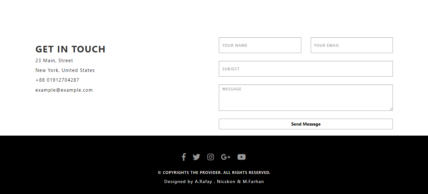
- Contact Forms6
- Responsive Footers8
- Javascript4
- Websites3
- Bootstrap Cards0
- Vanilla JavaScript1
- jQuery Effects0
- Bootstrap Sidebar Menus0
- CSS Sidebar Menus0
- Navigation Bars4
- Responsive Gallery3
- Responsive Feedback Page5
- Blog0