
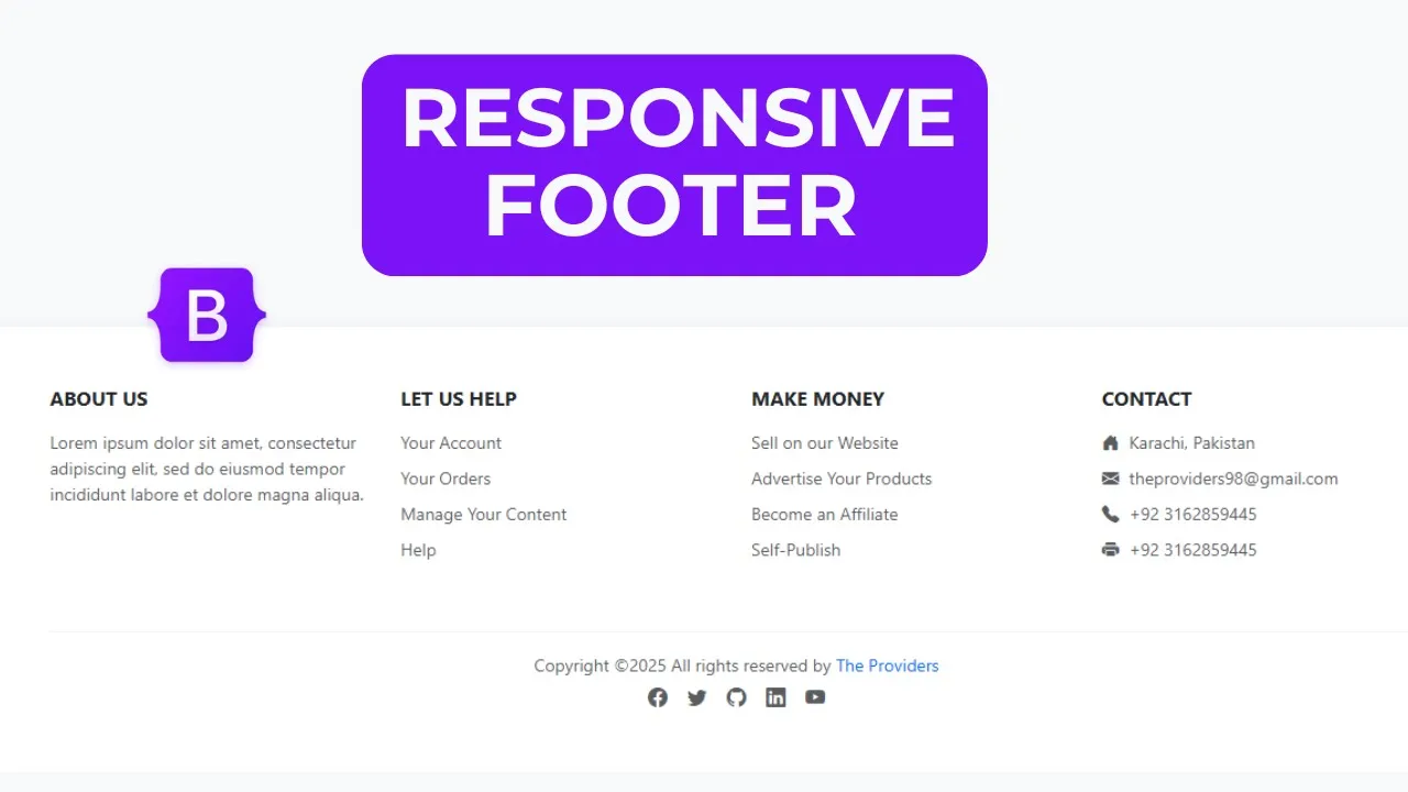
Bootstrap 5 Footer | Build a Professional Responsive Footer with Social media Icon

Bootstrap 5 Footer | Amazing Responsive Footer with Social media Icon
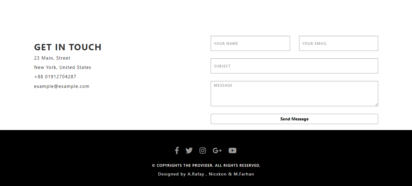
In this tutorial we'll build a professional, responsive footer using HTML, CSS and Bootstrap 5. Footers appear on every page and usually contain links, contact info, social icons and copyright text. This is a perfect beginner-friendly project that teaches layout, responsiveness and simple styling with Bootstrap utilities.
What you’ll build
A clean, modern footer that includes:
-
Brand / short about section
-
Quick links (ul → li → a)
-
Contact details (address, email, phone)
-
Sleek social media icons (Bootstrap Icons or any icon pack)
-
Copyright row and optional small print
What you’ll learn
-
Structure a footer using semantic
<footer>and Bootstrap grid (.row,.col-*) -
Use Bootstrap utilities for spacing, text color and alignment
-
Add social icons and style them with Bootstrap classes (buttons, outlines, spacing)
-
Make the footer responsive and accessible (good link text, readable contrast)
-
Small CSS tweaks for hover effects and visual polish
Step-by-step overview
-
Setup — include Bootstrap 5 CSS/JS and an icon set (Bootstrap Icons CDN).
-
Markup — create
<footer class="bg-... text-...">with a.containerand.row. -
Columns — add columns: About, Quick Links, Contact, Social. Use
.col-md-*for responsiveness. -
Icons — insert social icons inside anchor tags and use button/outline styles for consistent look.
-
Final touches — add
<hr>and a copyright line; optionally add small hover effects with a few CSS rules. -
Test — check spacing and layout on different screen sizes, ensure good contrast and tappable targets on mobile.
Let's Start HTML:
<!DOCTYPE html>
<html lang="en">
<head>
<meta charset="UTF-8">
<meta name="viewport" content="width=device-width, initial-scale=1.0">
<title>Bootstrap 5 Responsive Footer</title>
<link href="https://cdn.jsdelivr.net/npm/bootstrap@5.3.7/dist/css/bootstrap.min.css" rel="stylesheet" integrity="sha384-LN+7fdVzj6u52u30Kp6M/trliBMCMKTyK833zpbD+pXdCLuTusPj697FH4R/5mcr" crossorigin="anonymous">
<link rel="stylesheet" href="https://cdnjs.cloudflare.com/ajax/libs/font-awesome/7.0.0/css/all.min.css" integrity="sha512-DxV+EoADOkOygM4IR9yXP8Sb2qwgidEmeqAEmDKIOfPRQZOWbXCzLC6vjbZyy0vPisbH2SyW27+ddLVCN+OMzQ==" crossorigin="anonymous" referrerpolicy="no-referrer" />
</head>
<style>
.footer{
background-color: #0c457e;
color: #ecf0f1;
padding: 40px 0 0;
}
.footer a{
color: #bdc3c7;
text-decoration: none;
transition: color 0.3s;
}
footer a:hover{
color: #ffffff;
}
.footer-heading{
color: #ffffff;
margin-bottom: 20px;
font-weight: 600;
position: relative;
padding-bottom: 10px;
}
.footer-heading:after{
content: '';
position: absolute;
left: 0;
bottom: 0;
width: 50px;
height: 2px;
background: #3e83c4;
}
.footer-links li{
margin-bottom: 10px;
list-style: none;
}
.social-icons a{
display: inline-block;
width: 40px;
height: 40px;
background-color: #0d1216;
color: #ffffff;
border-radius: 50%;
text-align: center;
line-height: 40px;
margin-right: 10px;
transition: all 0.3s;
}
.social-icons a:hover{
background-color: #3e83c4;
transform: translateY(-3px);
}
.footer-bottom{
background-color: #0d1216;
padding: 20px 0;
margin-top: 40px;
}
</style>
<body>
<footer class="footer">
<div class="container">
<div class="row">
<div class="col-lg-4 col-md-6 mb-4 mb-lg-0">
<h5 class="footer-heading">About Company</h5>
<p>Passionate about web design, development, databases, and tech? "The Providers" is your YouTube hub! Explore tutorials spanning front-end, back-end, & Full Stack.</p>
<div class="social-icons mt-4">
<a href="#"><i class="fab fa-facebook-f"></i></a>
<a href="#"><i class="fab fa-twitter"></i></a>
<a href="#"><i class="fab fa-instagram"></i></a>
<a href="#"><i class="fab fa-linkedin-in"></i></a>
<a href="#"><i class="fab fa-youtube"></i></a>
</div>
</div>
<div class="col-lg-2 col-md-6 mb-4 mb-lg-0">
<h5 class="footer-heading">Quick Links</h5>
<ul class="footer-links ps-0">
<li><a href="#">Home</a></li>
<li><a href="#">About Us</a></li>
<li><a href="#">Services</a></li>
<li><a href="#">Portfolio</a></li>
<li><a href="#">Contact</a></li>
</ul>
</div>
<div class="col-lg-2 col-md-6 mb-4 mb-lg-0">
<h5 class="footer-heading">Services</h5>
<ul class="footer-links ps-0">
<li><a href="#">Web Design</a></li>
<li><a href="#">Web Development</a></li>
<li><a href="#">Graphic Design</a></li>
<li><a href="#">Digital Marketing</a></li>
<li><a href="#">SEO Services</a></li>
</ul>
</div>
<div class="col-lg-4 col-md-6">
<h5 class="footer-heading">Contact Info</h5>
<div class="mt-4">
<p><i class="fas fa-map-marker-alt me-2"></i>Karachi, Pakistan</p>
<p><i class="fas fa-phone me-2"></i>+923162859445</p>
<p><i class="fas fa-envelope me-2"></i>theproviders98@gmail.com</p>
</div>
</div>
</div>
</div>
<div class="footer-bottom">
<div class="container">
<div class="row">
<div class="col-md-6 text-center text-md-start">
<p class="mb-0">© 2025 The Providers. All righst reserved</p>
</div>
<div class="col-md-6 text-center text-md-end">
<ul class="list-inline mb-0">
<li class="list-inline-item"><a href="#">Privacy Policy</a></li>
<li class="list-inline-item"><a href="#">Terms Of Use</a></li>
<li class="list-inline-item"><a href="#">Sitemap</a></li>
</ul>
</div>
</div>
</div>
</div>
</footer>
<script src="https://cdn.jsdelivr.net/npm/bootstrap@5.3.7/dist/js/bootstrap.bundle.min.js" integrity="sha384-ndDqU0Gzau9qJ1lfW4pNLlhNTkCfHzAVBReH9diLvGRem5+R9g2FzA8ZGN954O5Q" crossorigin="anonymous"></script>
</body>
</html>
Recent Post

Most Popular Post

Categories
- HTML & CSS9
- Bootstrap4
- Login Forms11
- Sidebar Menu1
- Card Design1
- CSS Buttons3
- Social Media Buttons1
- Preloader or Loaders5
- Neumorphism Designs3
- Contact Forms6
- Responsive Footers8
- Javascript4
- Websites3
- Bootstrap Cards0
- Vanilla JavaScript1
- jQuery Effects0
- Bootstrap Sidebar Menus0
- CSS Sidebar Menus0
- Navigation Bars4
- Responsive Gallery3
- Responsive Feedback Page5
- Blog0