
Neumorphism Login Form Using Bootstrap 5 | Neumorphism Hover Animation
Neumorphism Login Form Using Bootstrap 5 | Neumorphism Hover Animation
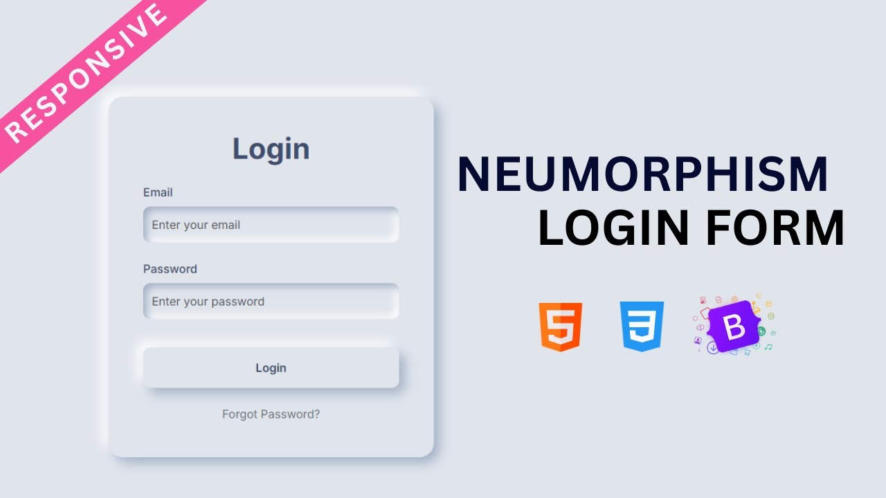
In this tutorial, you’ll learn how to build a modern and creative login form using Bootstrap 5 combined with Neumorphism design effects. Neumorphism (or soft UI) is a popular design trend that gives elements a 3D-like soft shadow look, making the interface feel elegant, minimal, and professional.
We’ll use HTML, CSS, and Bootstrap 5 to create a fully responsive login form with smooth hover animations, ensuring a better UI/UX experience for users. This tutorial is beginner-friendly yet stylish enough for real-world projects.
Features of the Neumorphism Login Form
-
Built with HTML, CSS, and Bootstrap 5
-
Clean and modern Neumorphism design
-
Smooth hover animation effects
-
Fully responsive layout for mobile, tablet, and desktop
-
Minimal, professional, and beginner-friendly
What You’ll Learn
-
How to structure a login form with Bootstrap 5 components
-
How to apply Neumorphism styles using CSS shadows
-
How to add hover animations for interactive design
-
How to make the form look professional and responsive
By the end of this tutorial, you’ll have a stunning Neumorphism login page that you can use for websites, portfolios, or any web project requiring authentication.
Let’s start building a Responsive Neumorphism Login Form with Bootstrap 5 and hover animation effects!
Let's write HTML First:
                                <!DOCTYPE html>
<html lang="en">
<head>
    <meta charset="UTF-8">
    <meta name="viewport" content="width=device-width, initial-scale=1.0">
    <title>Neumorphism Login Page using HTML, CSS & Bootstrap 5</title>
    <link href="https://cdn.jsdelivr.net/npm/bootstrap@5.3.8/dist/css/bootstrap.min.css" rel="stylesheet" integrity="sha384-sRIl4kxILFvY47J16cr9ZwB07vP4J8+LH7qKQnuqkuIAvNWLzeN8tE5YBujZqJLB" crossorigin="anonymous">
<link href="https://fonts.googleapis.com/css2?family=Inter:ital,opsz,wght@300;400;500;600;700;800;900&display=swap" rel="stylesheet">
</head>
<body>

        <main class="d-flex justify-content-center align-items-center min-vh-100">
            <div class="neumorphic-card">
                <h1 class="text-center fw-bold mb-4">Login</h1>
                <form action="">
                    <div class="mb-4">
                        <label for="email" class="form-label">Email</label>
                        <input type="email" class="form-control neumorphic-input" required id="email" placeholder="Enter Your Email">
                    </div>
                    <div class="mb-4">
                        <label for="password" class="form-label">Password</label>
                        <input type="password" class="form-control neumorphic-input" required id="password" placeholder="Enter Your Password">
                    </div>
                    <div class="d-grid">
                        <button type="submit" class="btn neumorphic-btn">Login</button>
                    </div>
                    <div class="mt-4 text-center">
                        <a href="#" class="text-secondary text-decoration-none">Forget Password?</a>
                    </div>
                </form>
            </div>
        </main>

</body>
</html>
Let's write CSS:
                                <style>
    :root{
        --bg-color: #e0e5ec;
        --main-color: #3f4e6d;
        --shadow-light: #ffffff;
        --shadow-dark: #a3b1c6;
    }
    body{
        font-family: 'Inter' , sans-serif;
        background-color: var(--bg-color);
    }
    .neumorphic-card{
        background-color: var(--bg-color);
        border-radius: 20px;
        box-shadow: 8px 8px 16px var(--shadow-dark), -8px -8px 16px var(--shadow-light);
        padding: 3rem;
        max-width: 450px;
        width: 100%;
        transition: all .8s ease-in-out;
    }
    .neumorphic-card:hover{
        box-shadow: 8px 8px 16px var(--shadow-light), -8px -8px 16px var(--shadow-dark);
    }
    .neumorphic-input{
        height: 50px;
        background-color: var(--bg-color);
        border: none;
        border-radius: 10px;
        box-shadow: inset 5px 5px 10px var(--shadow-dark) , inset -5px -5px 10px var(--shadow-light);
        transition: all 0.3s ease;
    }
    .neumorphic-input:focus{
        background-color: var(--bg-color);
        box-shadow: inset 2px 2px 5px var(--shadow-dark) , inset -2px -2px 5px var(--shadow-light) , 0 0 0 3px var(--main-color);
        border:none;
        outline: none;
    }
    .neumorphic-btn{
        margin-top: 15px;
        background-color: var(--bg-color);
        column-rule: var(--main-color);
        border-radius: 10px;
        font-weight: 600;
        box-shadow: 8px 8px 16px var(--shadow-dark), -8px -8px 16px var(--shadow-light);
        transition: all 0.5s ease-in-out;
        border: none;
        padding: 1rem;
    }
    .neumorphic-btn:hover{
        transform: scale(0.98);
        background-color: var(--main-color);
        color: var(--shadow-light);
    }
    .form-label{
        color: var(--main-color);
        font-weight: 500;
    }
</style>
Recent Post


Most Popular Post

Categories
- HTML & CSS9
- Bootstrap4
- Login Forms11
- Sidebar Menu1
- Card Design1
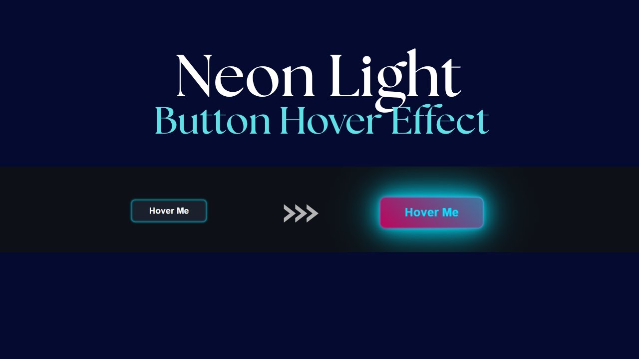
- CSS Buttons3
- Social Media Buttons1
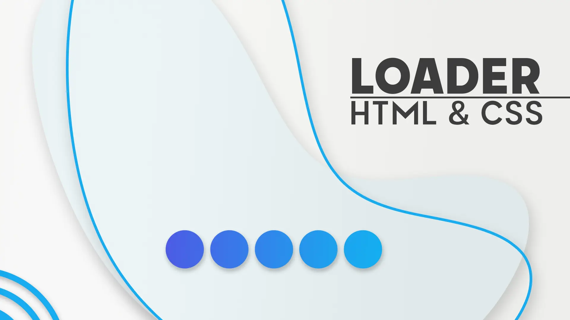
- Preloader or Loaders5
- Neumorphism Designs3
- Contact Forms6
- Responsive Footers8
- Javascript4
- Websites3
- Bootstrap Cards0
- Vanilla JavaScript1
- jQuery Effects0
- Bootstrap Sidebar Menus0
- CSS Sidebar Menus0
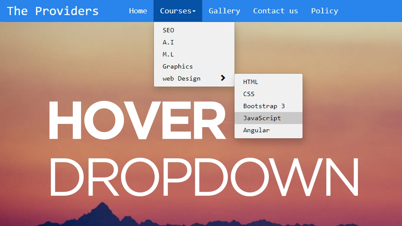
- Navigation Bars4
- Responsive Gallery3
- Responsive Feedback Page5
- Blog0