
How to Create Responsive Footer in Html CSS and Bootstrap 3

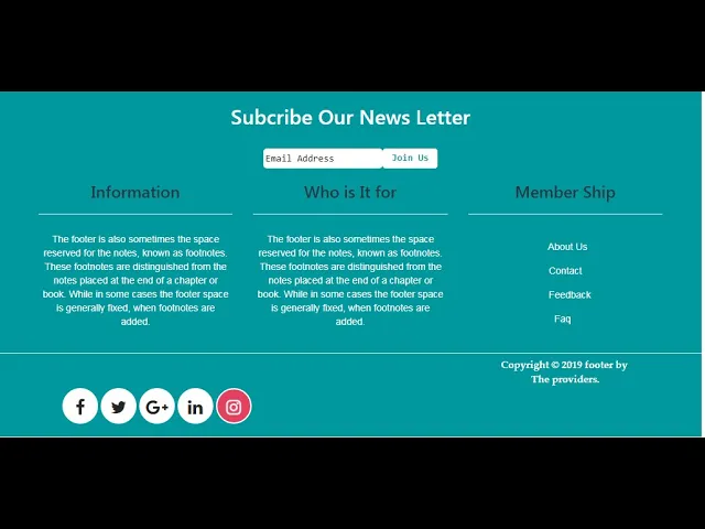
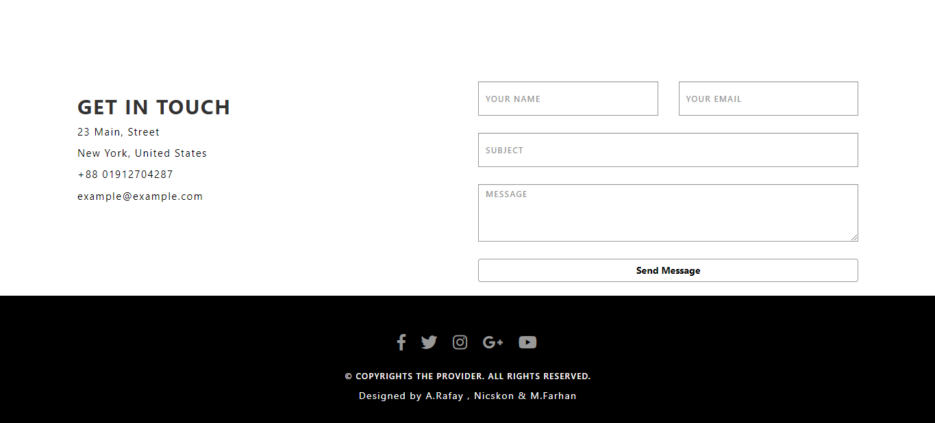
In this Tutorial Using HTML , CSS and Bootstrap We Create a Responsive Footer.Make a footer in HTML, CSS and Boostrap 3
Download Code Files
How to Create Responsive Footer in Html CSS and Bootstrap | make Bootstrap 3 Footer | Source File
In this Tutorial Using HTML , CSS and Bootstrap We Create a Responsive Footer
In this Tutorial Using HTML , CSS and Bootstrap We Create a Responsive Footer.Make a footer in HTML, CSS and Boostrap 3 - Learn HTML and CSS front-end programming code . In this tutorial I will guide how to create a footer in HTML and CSS. How to Design Responsive Footer in html css and Bootstrap | Footer Design html, CSS and Bootstrap.This video shows you how you can create a Responsive footer section using only Html , CSS and Bootstrap. We have provided Source File using Subtitles wherever necessary for You. Responsive Footer | Creative Footer | Professional Footer | Bootstrap Footer | Footer By The Providers. We are Given all types of stuffs for web designing and graphic designing.
Let's working
HTML
<!DOCTYPE html>
<html>
<head>
<title>Resposnive Footer</title>
<link rel="stylesheet" href="https://maxcdn.bootstrapcdn.com/bootstrap/3.4.1/css/bootstrap.min.css">
<script src="https://ajax.googleapis.com/ajax/libs/jquery/3.4.1/jquery.min.js"></script>
<script src="https://maxcdn.bootstrapcdn.com/bootstrap/3.4.1/js/bootstrap.min.js"></script>
<link rel="stylesheet" href="https://cdnjs.cloudflare.com/ajax/libs/font-awesome/5.13.0/css/all.min.css">
</head>
<body>
<div id="footer">
<br><br>
<div class="container-fluid">
<br> <br>
<div class="col-md-4">
<h2>About the Company</h2><br><br>
<p class="para">
In publishing and graphic design, Lorem ipsum is a placeholder text commonly used to ... Lorem ipsum
dolor sit amet, consectetur adipiscing elit, sed do eiusmod tempor incididunt ut labore et dolore
magna aliqua. Ut enim ad minim veniam.
</p><br>
<div class="media">
<ul class="list-unstyled">
<li><a href="#"> <i class="fab fa-facebook-f"> </i></a> </li>
<li><a href="#"> <i class="fab fa-twitter"> </i></a> </li>
<li><a href="#"> <i class="fab fa-instagram"> </i></a> </li>
<li><a href="#"> <i class="fab fa-google-plus-g"> </i></a> </li>
<li><a href="#"> <i class="fab fa-youtube"> </i></a> </li>
</ul>
</div>
</div>
<div class="col-md-4">
<h2>Contact us </h2><br><br>
<p class="cont"><i class="fa fa-map-marker"></i> 23 Main, Street New York, United States</p>
<p class="cont"> <i class="fa fa-phone"></i> 03162859445</p>
<p class="cont"><i class="fa fa-envelope"></i> theproviders98@gmail.com</p>
</div>
<div class="col-md-4">
<h2>Subcribe our Newsletter</h2><br><br>
<form><br>
<div class="row">
<div class="col-md-9">
<input type="Email" name="email" placeholder="Enter Email" class="form-control" required="">
</div>
<div class="col-md-3">
<button class="btn btn-info ">Submit</button>
</div>
</div>
</form>
</div>
</div>
<hr style="height: 5px;color: #fff;">
<p style="text-align: center;font-size: 16px;">Copyright ©2020 All rights reserved | This Footer is Develop by
Rafay , Farhan And Nick</p>
<br><br>
<br>
</div>
</body>
</html>
CSS
                                #footer {
		background-color: #292b3b;
		color: #fff;
		font-family: monospace;
	}

	.para {
		font-size: 15px;
	}


	.media ul li {
		float: left;
		padding-left: 20px;
		font-size: 28px;

	}

	.media ul li a {
		color: #fff;
		transition: 0.5s ease-in-out;
	}

	.media ul li a:hover {
		color: #346fcf;
	}

	.cont {
		font-size: 16px;
	}

	.btn-info {
		transition: 0.3s;
		letter-spacing: 2px;
		font-size: 15px;

	}

	.btn-info:hover {
		background-color: #346fcf;
	}

	h2 {
		color: #86b1f7;
		font-size: 32px;
	}
Conclusion