
Neon light effects 2020 in HTML & CSS | Neon light effect | Neon hover button
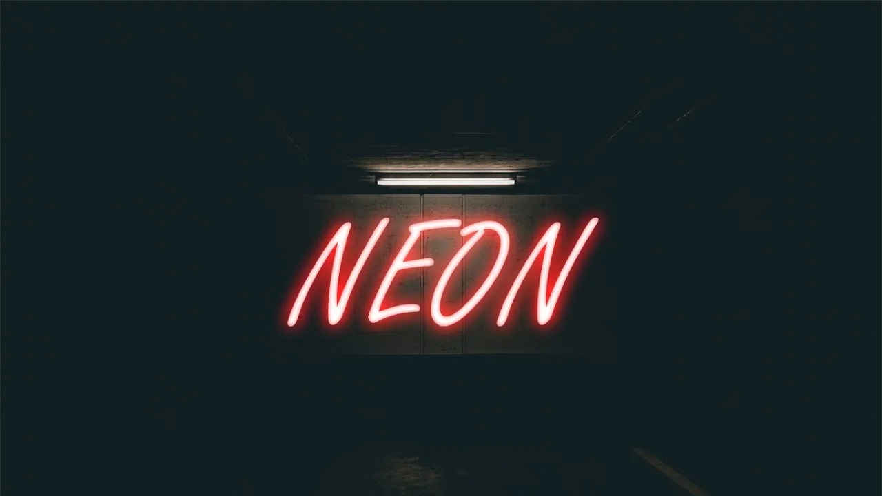
In this video, I will teach you how to Create a neon light effect using HTML and CSS on hover by very easy method.
Download Code Files
Neon light effects 2020 in HTML & CSS | How to create Neon light effect | Neon hover button
Description
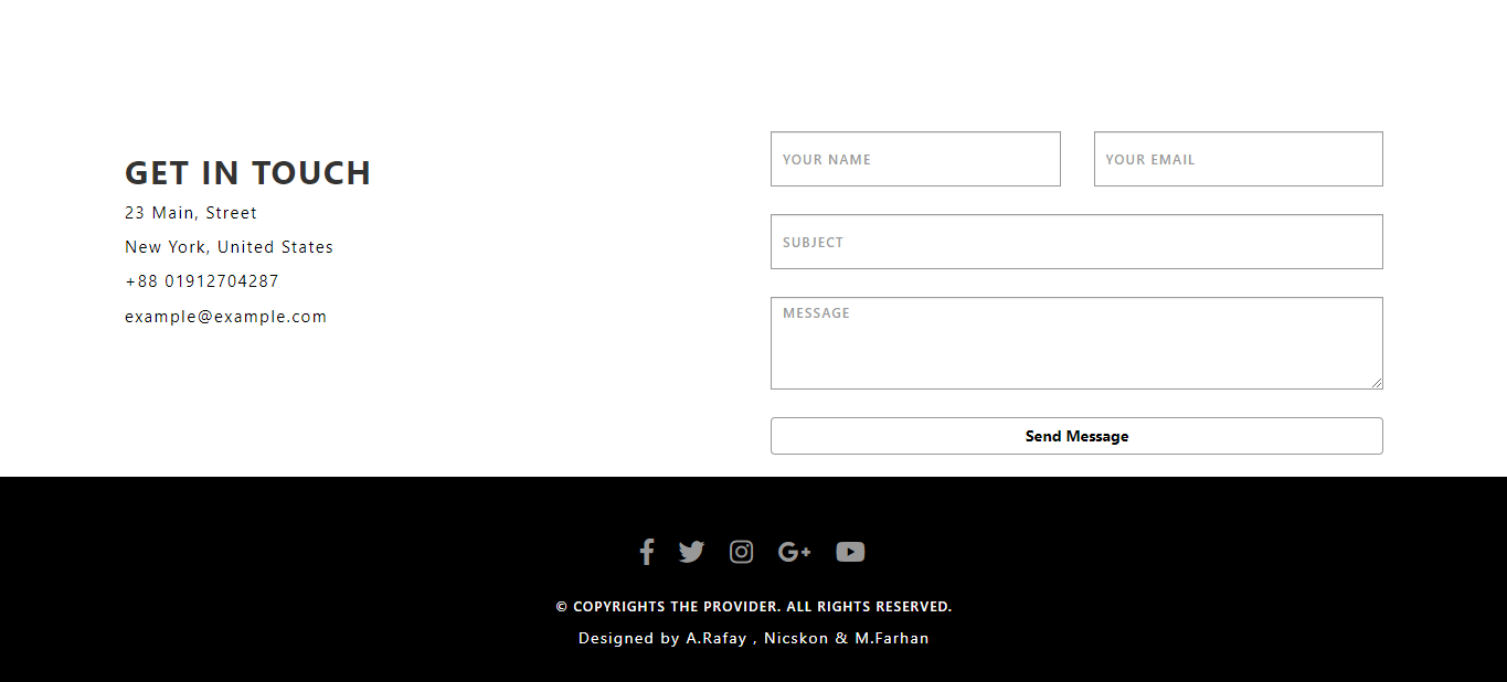
In this video, I will teach you how to Create a neon light effect using HTML and CSS on hover by very easy method. This CSS tutorial is interesting for professional web designers. How to make a Neon light effects in HTML and CSS | How to design a neon light effects | Awesome Neon Light Effect on hover.
How to make a Neon light effects in HTML and CSS | How to design a neon light effects | Awesome Neon Light Effect on hover.
HTML
                                <!DOCTYPE html>
<html>

<head>
	<title>Neon Hover Effect</title>
	<!-- Google Font -->
	<link href="https://fonts.googleapis.com/css2?family=Jost:wght@100&display=swap" rel="stylesheet">
	<!-- Style Sheet -->
	<link rel="stylesheet" type="text/css" href="style.css">
</head>

<body>
	<a href="#">hover me</a>

</body>
</html>
CSS
                                body {
		margin: 0;
		padding: 0;
		display: flex;
		justify-content: center;
		align-items: center;
		min-height: 100vh;
		font-family: 'jost', sans-serif;
		font-weight: bold;
		background: #201f29;
	}

	a {
		position: relative;
		color: #fff200;
		background: #201f29;
		box-shadow: 0 0 20px #fff200;
		font-size: 24px;
		padding: 15px 30px;
		letter-spacing: 4px;
		text-decoration: none;
		text-transform: uppercase;
		transition: .5s;
	}

	a:hover {
		color: #201f29;
		background: #fff200;
		box-shadow: 0 0 30px #fff200, 0 0 50px #fff200;
		-webkit-box-reflect: below 5px linear-gradient(to bottom, transparent, rgba(0, 0, 0, 0.3), rgba(0, 0, 0, 0.8));
		transition-delay: .5s;
	}
Conclusion
Recent Post


Most Popular Post


Categories
- HTML & CSS9
- Bootstrap4
- Login Forms11
- Sidebar Menu1
- Card Design1
- CSS Buttons3
- Social Media Buttons1
- Preloader or Loaders5
- Neumorphism Designs3
- Contact Forms6
- Responsive Footers8
- Javascript4
- Websites3
- Bootstrap Cards0
- Vanilla JavaScript1
- jQuery Effects0
- Bootstrap Sidebar Menus0
- CSS Sidebar Menus0
- Navigation Bars4
- Responsive Gallery3
- Responsive Feedback Page5
- Blog0