
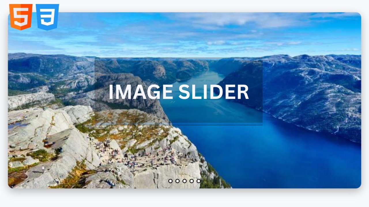
Responsive 3D touch Slider Using Html & CSS | CSS 3 Carousel Design | 3D Slider
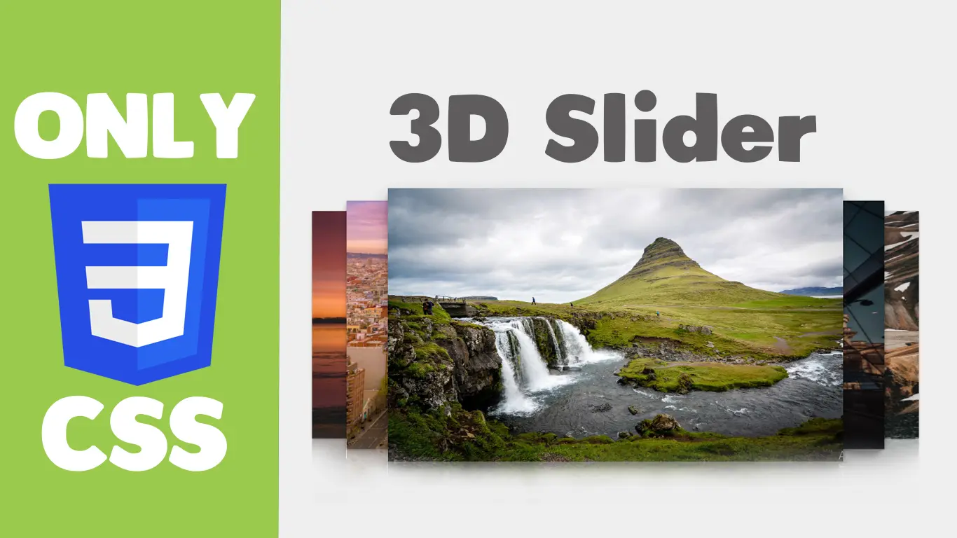
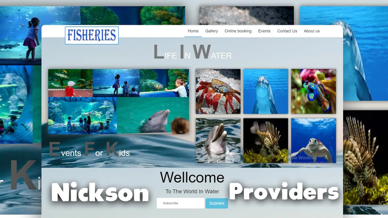
In this tutorial how to make beautiful Responsive 3D Carousel Slideer in Html and css .
Download Code Files
Responsive 3D touch Slider Using Html & CSS | CSS 3 Carousel Design | Build 3D Slider | Source File
In this video we will learn something interesting which will cover CSS3 3d Image Slider with Css.3D images slideshow using html and css. In this website design and educational tutorial i will be showing you that - CSS 3 Carousel & Slider Design || Modern Slider using css 3
In this tutorial how to make beautiful Responsive 3D Carousel Slideer in Html and css . We are creating CSS 3D Slider on click Change Slider with CSS3. How to Create 3D Carousel Slider | How to make Rotation 3D Slider in CSS 3 .
In this video we will learn something interesting which will cover CSS3 3d Image Slider with Css.3D images slideshow using html and css. In this website design and educational tutorial i will be showing you that - CSS 3 Carousel & Slider Design || Modern Slider using css 3
HTML
                                <!DOCTYPE html>
<html>
<head>
  <title>3D Slider</title>
  <script src="https://ajax.googleapis.com/ajax/libs/jquery/3.5.1/jquery.min.js"></script>
</head>
<body>

  <br>
  <h1 style="text-align: center;font-size: 42px;font-family: monospace;">3D Carousel Slider</h1>

  <br><br>

  <section id="slider">
    <input type="radio" name="slider" id="s1">
    <input type="radio" name="slider" id="s2">
    <input type="radio" name="slider" id="s3" checked>
    <input type="radio" name="slider" id="s4">
    <input type="radio" name="slider" id="s5">
    <label for="s1" id="slide1">
      <img
        src="https://media.istockphoto.com/id/517188688/photo/mountain-landscape.jpg?s=1024x1024&w=0&k=20&c=z8_rWaI8x4zApNEEG9DnWlGXyDIXe-OmsAyQ5fGPVV8="
        height="100%" width="100%">
    </label>
    <label for="s2" id="slide2">
      <img src="https://webneel.com/wallpaper/sites/default/files/images/08-2018/3-nature-wallpaper-mountain.jpg"
        height="100%" width="100%">
    </label>
    <label for="s3" id="slide3">
      <img src="https://cdn.pixabay.com/photo/2018/01/14/23/12/nature-3082832__340.jpg" height="100%" width="100%">
    </label>
    <label for="s4" id="slide4">
      <img src="https://encrypted-tbn0.gstatic.com/images?q=tbn:ANd9GcQUPIfiGgUML8G3ZqsNLHfaCnZK3I5g4tJabQ&s"
        height="100%" width="100%">
    </label>
    <label for="s5" id="slide5">
      <img src="https://wallpaperaccess.com/full/91498.jpg" height="100%" width="100%">
    </label>
  </section>
</body>
</html>
CSS
                                * {
    margin: 0;
    padding: 0;
  }

  body {
    padding: 20px;
    background: #eee;
    user-select: none;
  }

  [type=radio] {
    display: none;
  }

  #slider {
    height: 35vw;
    position: relative;
    perspective: 1000px;
    transform-style: preserve-3d;
  }

  #slider label {
    margin: auto;
    width: 60%;
    height: 100%;
    border-radius: 4px;
    position: absolute;
    left: 0;
    right: 0;
    cursor: pointer;
    transition: transform 0.4s ease;
  }

  #s1:checked~#slide4,
  #s2:checked~#slide5,
  #s3:checked~#slide1,
  #s4:checked~#slide2,
  #s5:checked~#slide3 {
    box-shadow: 0 1px 4px 0 rgba(0, 0, 0, .37);
    transform: translate3d(-30%, 0, -200px);
  }

  #s1:checked~#slide5,
  #s2:checked~#slide1,
  #s3:checked~#slide2,
  #s4:checked~#slide3,
  #s5:checked~#slide4 {
    box-shadow: 0 6px 10px 0 rgba(0, 0, 0, .3), 0 2px 2px 0 rgba(0, 0, 0, .2);
    transform: translate3d(-15%, 0, -100px);
  }

  #s1:checked~#slide1,
  #s2:checked~#slide2,
  #s3:checked~#slide3,
  #s4:checked~#slide4,
  #s5:checked~#slide5 {
    box-shadow: 0 13px 25px 0 rgba(0, 0, 0, .3), 0 11px 7px 0 rgba(0, 0, 0, .19);
    transform: translate3d(0, 0, 0);
  }

  #s1:checked~#slide2,
  #s2:checked~#slide3,
  #s3:checked~#slide4,
  #s4:checked~#slide5,
  #s5:checked~#slide1 {
    box-shadow: 0 6px 10px 0 rgba(0, 0, 0, .3), 0 2px 2px 0 rgba(0, 0, 0, .2);
    transform: translate3d(15%, 0, -100px);
  }

  #s1:checked~#slide3,
  #s2:checked~#slide4,
  #s3:checked~#slide5,
  #s4:checked~#slide1,
  #s5:checked~#slide2 {
    box-shadow: 0 1px 4px 0 rgba(0, 0, 0, .37);
    transform: translate3d(30%, 0, -200px);
  }
JavaScript
                                $(function () {
      $('#slider').slider({
        current: 0,
        autoplay: true,
        interval: 3000
      });
    });
Conclusion
Recent Post


Most Popular Post


Categories
- HTML & CSS9
- Bootstrap4
- Login Forms11
- Sidebar Menu1
- Card Design1
- CSS Buttons3
- Social Media Buttons1
- Preloader or Loaders5
- Neumorphism Designs3
- Contact Forms6
- Responsive Footers8
- Javascript4
- Websites3
- Bootstrap Cards0
- Vanilla JavaScript1
- jQuery Effects0
- Bootstrap Sidebar Menus0
- CSS Sidebar Menus0
- Navigation Bars4
- Responsive Gallery3
- Responsive Feedback Page5
- Blog0