
How to Create a Responsive Gallery | Portfolio Gallery | Make Image Gallery in Website
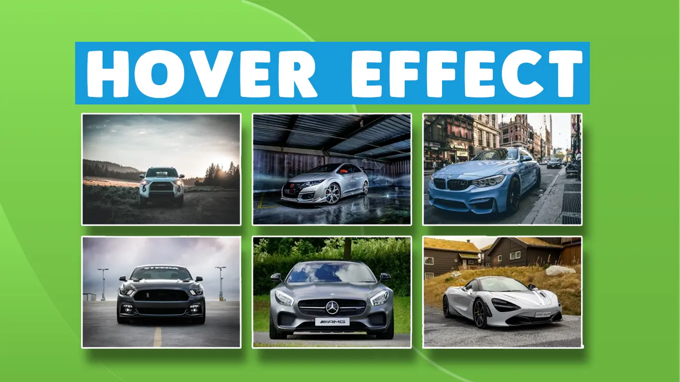
In this website design Tutorial I will guide you that how to create the Image Gallery in HTML 5 CSS 3 Bootstrap
Download Code Files
How to Create a Responsive Gallery | Portfolio Gallery| (make Image Gallery in Website) |Source File
Description
In this website design Tutorial I will guide you that how to create the Image Gallery in HTML 5 CSS 3 Bootstrap and . Hope this website design tutorial will help you alot more.
In this website design Tutorial I will guide you that how to create the Image Gallery in HTML 5 CSS 3 Bootstrap and . Hope this website design tutorial will help you alot more.In this tutorial you will be learning how to make Image Gallery. In this video we will learn how to create a responsive image gallery layout using css grid. This would be perfect for a website that wants to showcase some sort of work, whether it's a portfolio or gallery.
HTML
                                <!DOCTYPE html>
<html>

<head>
	<title>Galley With Hover</title>
	<link rel="stylesheet" href="https://maxcdn.bootstrapcdn.com/bootstrap/3.4.1/css/bootstrap.min.css">
	<script src="https://ajax.googleapis.com/ajax/libs/jquery/3.4.1/jquery.min.js"></script>
	<script src="https://maxcdn.bootstrapcdn.com/bootstrap/3.4.1/js/bootstrap.min.js"></script>
</head>
<body>
	<br>

	<div class="container">
		<br>
		<div class="row">
			<br>
			<div class="col-md-4 col-sm-6">
				<div class="fulldiv">
					<img src="https://images.pexels.com/photos/170811/pexels-photo-170811.jpeg?cs=srgb&dl=pexels-mikebirdy-170811.jpg&fm=jpg"
						width="100%" height="270px">
					<div class="img_cr">
						<div class="carousel-caption">
							<p>Company : Toyota</p>
							<p>Car Name : Vigo</p>
							<p>Price : $30000</p>
						</div>
					</div>
				</div>
			</div>


			<div class="col-md-4 col-sm-6">
				<div class="fulldiv">
					<img src="https://images.pexels.com/photos/170811/pexels-photo-170811.jpeg?cs=srgb&dl=pexels-mikebirdy-170811.jpg&fm=jpg"
						width="100%" height="270px">
					<div class="img_cr">
						<div class="carousel-caption">
							<p>Company : Honda</p>
							<p>Car Name : Civic</p>
							<p>Price : $30000</p>

						</div>
					</div>
				</div>
			</div>


			<div class="col-md-4 col-sm-6">
				<div class="fulldiv">
					<img src="http://wallpaperset.com/w/full/8/0/2/483053.jpg" width="100%" height="270px">
					<div class="img_cr">
						<div class="carousel-caption">
							<p>Company : BMW</p>
							<p>Car Name : BMW3</p>
							<p>Price : $35000</p>

						</div>
					</div>
				</div>
			</div>


			<div class="col-md-4 col-sm-6">
				<div class="fulldiv">
					<img src="https://play-lh.googleusercontent.com/ziJYOlBtep92tSPoGaHnDjNOftddztTBJOvOwh7MCsFKPIl3l7rhFiUI9MO5IlcpYUs=w240-h480-rw"
						width="100%" height="270px">
					<div class="img_cr">
						<div class="carousel-caption">
							<p>Company : Toyota</p>
							<p>Car Name : Audi4</p>
							<p>Price : $40000</p>
						</div>
					</div>
				</div>
			</div>


			<div class="col-md-4 col-sm-6">
				<div class="fulldiv">
					<img src="https://encrypted-tbn0.gstatic.com/images?q=tbn:ANd9GcRMRs8rSVb1QK21MWIPUxalMQ9c1IlZjqI8xw&usqp=CAU"
						width="100%" height="270px">
					<div class="img_cr">
						<div class="carousel-caption">
							<p>Company : Mitsubish</p>
							<p>Car Name : Vigo</p>
							<p>Price : $60000</p>

						</div>
					</div>
				</div>
			</div>

			<div class="col-md-4 col-sm-6">
				<div class="fulldiv">
					<img src="https://encrypted-tbn0.gstatic.com/images?q=tbn:ANd9GcR-gMSURTVJRreLMH2hCkCMaEDKP66xH60frA&usqp=CAU"
						width="100%" height="270px">
					<div class="img_cr">
						<div class="carousel-caption">
							<p>Company : HOnda</p>
							<p>Car Name : Vigo</p>
							<p>Price : $30000</p>

						</div>
					</div>

				</div>
			</div>
		</div>
	</div>

</body>
</html>
CSS
                                .carousel-caption {
		font-family: monospace;
		font-size: 17px;
		font-weight: bold;
		margin-bottom: 45px;
		opacity: 0;
		transition: 0.3s ease-in-out;
		cursor: pointer;

	}

	img {
		transition: 0.3s;
		opacity: 1;
		cursor: pointer;
		padding-bottom: 18px;
		filter: grayscale(0);
		transition: 0.3s ease-in-out;
	}

	.fulldiv {
		transition: 0.5s ease-in-out;
	}

	.col-md-4 .fulldiv:hover {
		display: block;
		opacity: 0.9;
		border-radius: 5px;
		filter: grayscale(100%);
		transform: scale(1.04);
		transform: translateY(-10px);
		box-shadow: 2px 4px 18px #666666;
	}
	.col-md-4:hover .carousel-caption {
		opacity: 1;
	}
Conclusion