
Bootstrap 4 Sidebar Menu Responsive with Sub menu | Create Responsive Side Navigation

Bootstrap 4 Sidebar Menu Responsive with Sub menu | Create Responsive Side Navigation | Source File
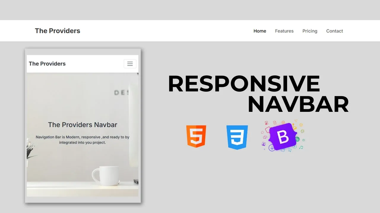
How to create the Responsive Side Navigation Bar Using HTML CSS and Bootstrap | Bootstrap 4 Sidebar Menu Responsive with Sub menu | Bootstrap 4 sidebar menu with sub menu responsive with code 2020 | Bootstrap 4 Sidebar.
In this video tutorial, We going to learn about Bootstrap 4 sidebar . We can easily create bootstrap 4 sidebar with sub menu using Bootstrap 4. Where I create three layers of the submenu in this sidebar. By using collapse session and toggle function of bootstrap 4 I designed this sidebar or sideBar. How to create the Responsive Side Navigation Bar Using HTML CSS and Bootstrap | Bootstrap 4 Sidebar Menu Responsive with Sub menu | Bootstrap 4 sidebar menu with sub menu responsive with code 2020 | Bootstrap 4 Sidebar.
HTML
                                <!DOCTYPE html>
<html>

<head>
	<title>Collapse sidebar in Bootstrap 4</title>
	<link rel="stylesheet" href="https://maxcdn.bootstrapcdn.com/bootstrap/4.0.0/css/bootstrap.min.css"
		integrity="sha384-Gn5384xqQ1aoWXA+058RXPxPg6fy4IWvTNh0E263XmFcJlSAwiGgFAW/dAiS6JXm" crossorigin="anonymous">
	<link rel="stylesheet" href="https://cdnjs.cloudflare.com/ajax/libs/font-awesome/5.13.0/css/all.min.css">
	<script src="https://cdnjs.cloudflare.com/ajax/libs/font-awesome/5.13.0/js/all.min.js"></script>
</head>
<body>


	<div class="wrapper">

		<nav id="sidebar">

			<div class="sidebar-header">
				<h3>Bootstrap Slider</h3>
			</div>
			<ul class="lisst-unstyled components">

				<p>The Providers</p>
				<li class="active">
					<a href="#homeSubmenu" data-toggle="collapse" aria-expanded="false" class="dropdown-toggle">Home</a>
					<ul class="collapse list-unstyled" id="homeSubmenu">
						<li>
							<a href="#">Home 1</a>
						</li>
						<li>
							<a href="#">Home 2</a>
						</li>

					</ul>
				</li>
				<li>
					<a href="#">About</a>
				</li>
				<li>
					<a href="#pageSubmenu" data-toggle="collapse" aria-expanded="false"
						class="dropdown-toggle">Pages</a>
					<ul class="collapse list-unstyled" id="pageSubmenu">
						<li>
							<a href="#">Page 1</a>
						</li>
						<li>
							<a href="#">Page 2</a>
						</li>


					</ul>
				</li>

				<li>
					<a href="#">Policy</a>
				</li>

				<li>
					<a href="#">Contact Us</a>
				</li>

			</ul>
		</nav>


		<div id="content">

			<nav class="navbar navbar-expand-lg navbar-light bg-light">
				<div class="container-fluid">
					<button type="button" id="sidebarCollapse" class="btn  btn-info">
						<i class="fas fa-align-left"></i>
						<span>Toggle Sidebar</span>

					</button>
				</div>
			</nav>

			<br><br>
			<h2>Collapseible Sidebar using Bootstrap 4</h2>
			<p>
				It is a long established fact that a reader will be distracted by the readable content of a page when
				looking at its layout. The point of using Lorem Ipsum is that it has a more-or-less normal distribution
				of letters, as opposed to using 'Content here, content here', making it look like readable English. Many
				desktop publishing packages and web page editors now use Lorem Ipsum as their default model text, and a
				search for 'lorem ipsum' will uncover many web sites still in their infancy. Various versions have
				evolved over the years, sometimes by accident, sometimes on purpose (injected humour and the like).

			</p>

			<div class="line"></div>
			<h3>Lorem Ipsum</h3>

			<p>
				It is a long established fact that a reader will be distracted by the readable content of a page when
				looking at its layout. The point of using Lorem Ipsum is that it has a more-or-less normal distribution
				of letters, as opposed to using 'Content here, content here', making it look like readable English. Many
				desktop publishing packages and web page editors now use Lorem Ipsum as their default model text, and a
				search for 'lorem ipsum' will uncover many web sites still in their infancy. Various versions have
				evolved over the years, sometimes by accident, sometimes on purpose (injected humour and the like).
			</p>
		</div>
	</div>
	<script src="https://code.jquery.com/jquery-3.2.1.slim.min.js"
		integrity="sha384-KJ3o2DKtIkvYIK3UENzmM7KCkRr/rE9/Qpg6aAZGJwFDMVNA/GpGFF93hXpG5KkN"
		crossorigin="anonymous"></script>
	<script src="https://cdnjs.cloudflare.com/ajax/libs/popper.js/1.12.9/umd/popper.min.js"
		integrity="sha384-ApNbgh9B+Y1QKtv3Rn7W3mgPxhU9K/ScQsAP7hUibX39j7fakFPskvXusvfa0b4Q"
		crossorigin="anonymous"></script>
	<script src="https://maxcdn.bootstrapcdn.com/bootstrap/4.0.0/js/bootstrap.min.js"
		integrity="sha384-JZR6Spejh4U02d8jOt6vLEHfe/JQGiRRSQQxSfFWpi1MquVdAyjUar5+76PVCmYl"
		crossorigin="anonymous"></script>
	<script>
		$(document).ready(function () {
			$('#sidebarCollapse').on('click', function () {
				$('#sidebar').toggleClass('active');
			});
		});
	</script>
</body>
</html>
CSS
                                body {
		font-family: 'Poppins', sans-serif;
		background: #fafafa;
	}

	p {
		font-family: 'Poppins', sans-serif;
		font-size: 1.1em;
		font-weight: 300;
		line-height: 1.7em;
		color: #999;
	}

	a,
	a:hover,
	a:focus {
		color: inherit;
		text-decoration: none;
		transition: all 0.3s;
	}

	/* Side Bar*/

	#sidebar.active {
		margin-left: -250px;
	}

	.wrapper {
		display: flex;
		text-decoration: none;
		transition: all 0.3s;
	}

	#sidebar {
		min-width: 250px;
		max-width: 250px;
		background: #7386D5;
		color: #fff;
		transition: all 0.3s;
	}


	#sidebar .sidebar-header {
		padding: 20px;
		background: #6d7fcc;
	}

	#sidebar ul.components {
		padding: 20px 0;
		border-bottom: 1px solid #47748b;
	}

	#sidebar ul p {
		color: #fff;
		padding: 10px;
	}

	#sidebar ul li a {
		padding: 10px;
		font-size: 1.1em;
		display: block;
	}

	#sidebar ul li a:hover {
		color: #7386D5;
		background: #fff;
	}

	#sidebar ul li.active>a,
	a[aria-expanded="true"] {
		color: #fff;
		background: #6d7fcc;
	}

	a[data-toggle="collapse"] {
		position: relative;
	}

	.dropdown-toggle::after {
		display: block;
		position: absolute;
		top: 50%;
		right: 20%;
		transform: translateY(-50%);
	}

	ul ul a {
		font-size: 0.9em !important;
		padding-left: 30px !important;
		background: #6d7fcc;
	}

	#content {
		width: 100%;
		padding: 20px;
		min-height: 100vh;
		transition: all 0.3s;
	}


	@media (max-width: 768px) {
		#sidebar {
			margin-left: -250px;
		}

		#sidebar.active {
			margin-left: 0;
		}

		#sidebarCollapse span {
			display: none;
		}
	}
Conclusion
Recent Post


Most Popular Post


Categories
- HTML & CSS9
- Bootstrap4
- Login Forms11
- Sidebar Menu1
- Card Design1
- CSS Buttons3
- Social Media Buttons1
- Preloader or Loaders5
- Neumorphism Designs3
- Contact Forms6
- Responsive Footers8
- Javascript4
- Websites3
- Bootstrap Cards0
- Vanilla JavaScript1
- jQuery Effects0
- Bootstrap Sidebar Menus0
- CSS Sidebar Menus0
- Navigation Bars4
- Responsive Gallery3
- Responsive Feedback Page5
- Blog0