
Awesome CSS Search Box Using Only HTML & CSS | Animated Search Box
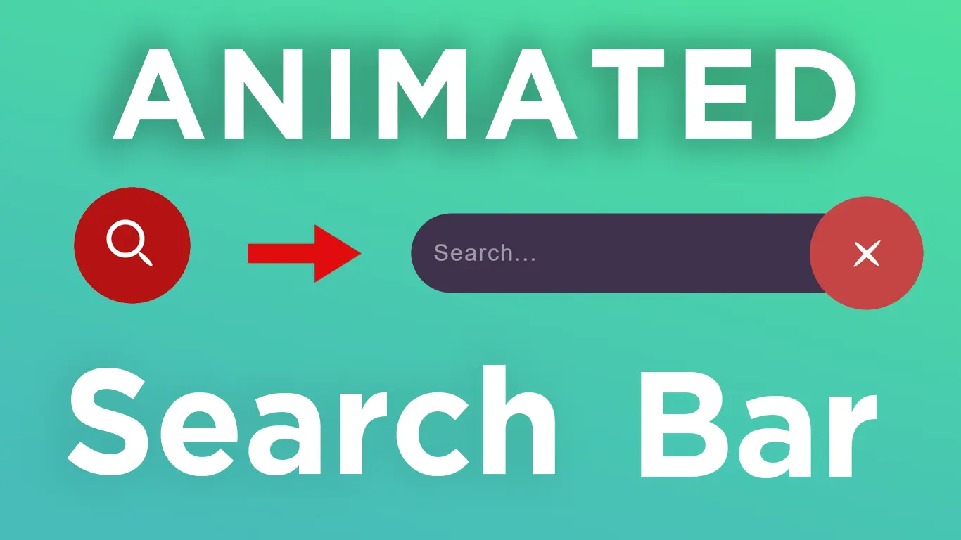
In this tutorial, I will teach you animated CSS Search bar built using only HTML & CSS.
Download Code Files
Awesome CSS Search Box Using Only HTML & CSS | Animated Search Box | Expanding Animated Search box
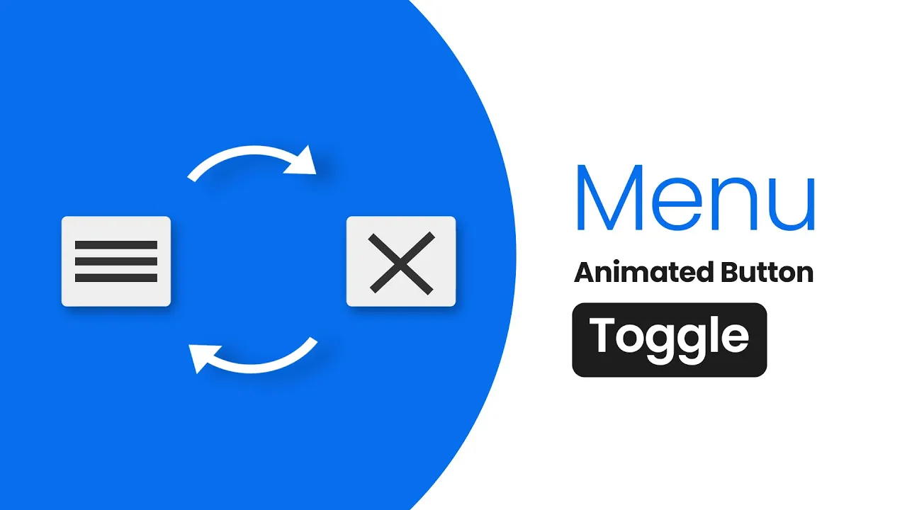
In this tutorial, I will teach you animated CSS Search bar built using only HTML & CSS. We make animated the search box using HTML and CSS. We use pseudo classes such as hover-within to create the PURE CSS animation. Animated Search Box Effect.If you want to create animated Search box effect for your Website then this tutorial is for you.
Animated Search Box Effect.If you want to create animated Search box effect for your Website then this tutorial is for you.
HTML
                                <!DOCTYPE html>
<html>

<head>
  <title>Animated Search Bar | The Providers</title>
  <link href="https://fonts.googleapis.com/css2?family=Jost:wght@500&display=swap" rel="stylesheet">
</head>

<body>
  <input type="checkbox" id="chk" name="checkbox">
  <label for="chk" id="toggle"></label>
  <input type="text" id="search-bar" placeholder="Search..." name="search">
</body>
</html>
CSS
                                *,
  :before,
  :after {
    margin: 0;
    padding: 0;
    box-sizing: border-box;
  }

  body {
    display: flex;
    justify-content: center;
    align-items: center;
    min-height: 100vh;
    font-family: 'jost', sans-serif;
    background: linear-gradient(to right top, #051937, #004d7a, #008793, #00bf72, #a8eb12)
  }

  #chk {
    display: none;
  }

  #toggle {
    position: relative;
    width: 5em;
    height: 5em;
    background: #b41313;
    color: #fff;
    overflow: hidden;
    border-radius: 50%;
    z-index: 1;
    margin-left: -1.25em;
    order: 1;
    transform: translateX(-10em) rotate(45deg);
    transition: .65s ease-out;
    cursor: pointer;
    box-shadow: 0 2px 10px rgba(0, 0, 0, 0, 9);
  }

  #chk:checked~#toggle {
    background: #c44545;
    transform: translateX(0em) rotate(45deg);
  }

  #toggle:before,
  #toggle:after {
    content: '';
    position: absolute;
    top: 50%;
    left: 50%;
    width: 1.625em;
    height: 1.625em;
    margin: -0.8125em;
    transition: inherit;
  }

  #toggle:before {
    background: #fff;
    margin-top: -0.08125em;
    height: 0.203125em;
    border-radius: 50%;
    transform-origin: 100% 0;
    transform: translateX(0.40625em) scaleX(.5);
  }

  #toggle:after {
    border: solid 0.203125em #fff;
    border-radius: 50%;
    transform: translate(-0.40625em) scaleX(0.999);
    transition-timing-function: cubic-bezier(42, 0, 2.42, 6);
  }

  #chk:checked~#toggle:before {
    transform: translateX(-0.05em) scaleX(.9);
  }

  #chk:checked~#toggle:after {
    box-shadow: inset 0 0 0 0.8125em #fff;
    transform: translateX(0.025em) scaleX(0.125);
  }

  #search-bar {
    padding: 0 1em;
    width: 20em;
    height: 3.5em;
    background: #3f324d;
    color: #fff;
    font-size: 1em;
    border: none;
    outline: none;
    transform: translateX(10em);
    clip-path: inset(-2em 100%);
    transition: .65s;
    box-shadow: 0 0 10px rgba(0, 0, 0, 0.9);
    border-radius: 3.25em;
    margin-right: -1.25em;
  }

  #search-bar::placeholder {
    opacity: .5;
    color: inherit;
    font-size: 1em;
    letter-spacing: 1px;
    border-radius: 3.25em
  }

  #chk:checked~#search-bar {
    transform: translateX(-0em);
    clip-path: inset(-2em 0%);
  }
Conclusion