
Social media icons on button | Awesome Social media icons in html and css
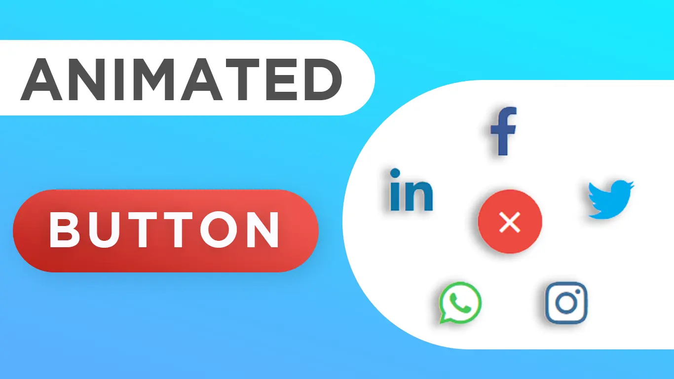
In this tutorial, i will teach you How to show social media icon on button click in html and css no javaScript.
Download Code Files
Show Social media icons on button | Awesome Social media icons | Social media icons in html and css
In this tutorial, i will teach you How to show social media icon on button click in html and css no javaScript. This video is very interesting because its not available on any channel.
In this tutorial, i will teach you How to show social media icon on button click in html and css no javaScript. This video is very interesting because its not available on any channel. Other Query : how to create Social Media icons on click button How to make a social media icons in website Professional Awesome icons
HTML
                                <!DOCTYPE html>
<html>
<head>
  <title>Social Media Button</title>
  <link rel="stylesheet" type="text/css"
    href="https://cdnjs.cloudflare.com/ajax/libs/font-awesome/5.12.0-2/css/all.min.css">
</head>

<body>
  <input id="chk" type="checkbox" />
  <label for="chk">+</label>
  <span id="one"><i class="fab fa-facebook-f"></i></span>
  <span id="two"><i class="fab fa-twitter"></i></span>
  <span id="three"><i class="fab fa-instagram"></i></span>
  <span id="four"><i class="fab fa-whatsapp"></i></span>
  <span id="five"><i class="fab fa-linkedin-in"></i></span>
</body>

</html>
CSS
                                body {
    margin: 0;
    padding: 0;
    height: 100vh;
  }

  #chk {
    display: none;
  }

  label {
    position: absolute;
    top: 46%;
    left: 47.5%;
    padding: 4px 18px;
    background: #e3807b;
    color: #FFF;
    font-size: 3em;
    font-weight: bolder;
    transition: .8s;
    border-radius: 50%;
    cursor: pointer;
  }

  span {
    position: absolute;
    top: 50%;
    left: 50%;
    transform: translate(-50%, -50%);
    font-size: 1.5em;
    border-radius: 50%;
    z-index: -1;
    transition-duration: .5s;
    transition-timing-function: cubic-bezier(0.175, 0.885, 0.32, 1.275);
    cursor: pointer;
    opacity: 0;

  }

  span i {
    font-size: 2em;
  }

  #chk:checked~label {
    transform: rotateZ(405deg);
    background: #ed4a42
  }

  #chk:checked~#one {
    color: #3b5998;
    transform: translateY(-4.5em) translateX(-1em);
    opacity: 1;
  }

  #chk:checked~#two {
    color: #00acee;
    transform: translateY(-1.7em) translateX(3em);
    transition-delay: .2s;
    opacity: 1;

  }

  #chk:checked~#three {
    color: #3f729b;
    transform: translateX(1.3em) translateY(2.5em);
    transition-delay: .4s;
    opacity: 1;


  }

  #chk:checked~#four {
    color: #4ac959;
    transform: translateX(-3em) translateY(2.5em);
    transition-delay: .6s;
    opacity: 1;

  }

  #chk:checked~#five {
    color: #0e76a8;
    transform: translateX(-5em) translateY(-2em);
    ;
    transition-delay: .8s;
    opacity: 1;
  }
Conclusion
Recent Post


Most Popular Post


Categories
- HTML & CSS9
- Bootstrap4
- Login Forms11
- Sidebar Menu1
- Card Design1
- CSS Buttons3
- Social Media Buttons1
- Preloader or Loaders5
- Neumorphism Designs3
- Contact Forms6
- Responsive Footers8
- Javascript4
- Websites3
- Bootstrap Cards0
- Vanilla JavaScript1
- jQuery Effects0
- Bootstrap Sidebar Menus0
- CSS Sidebar Menus0
- Navigation Bars4
- Responsive Gallery3
- Responsive Feedback Page5
- Blog0
Related Post
-
No Related Snippets