
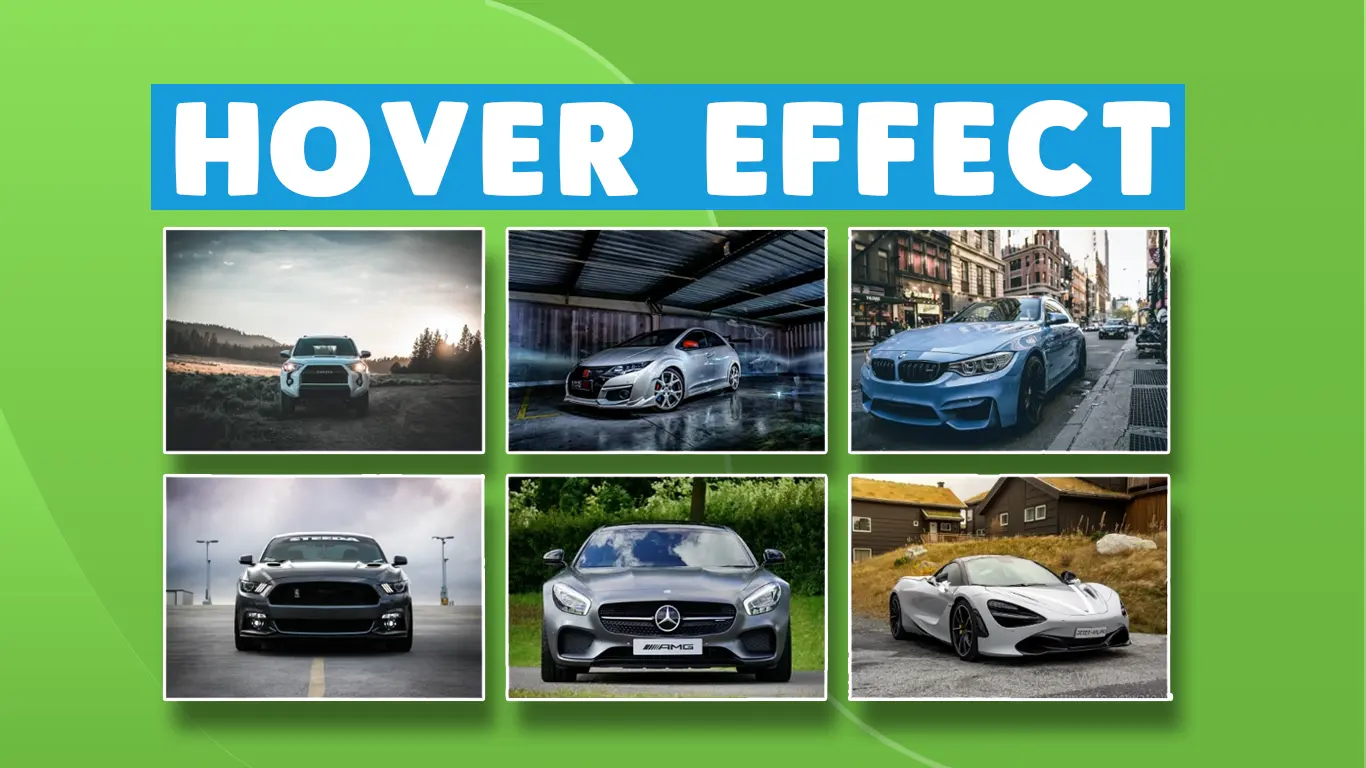
How to Create Image Gallery hover effects in HTML, CSS & Bootstrap | Gallery with hover

How to Create Image Gallery hover effects in HTML, CSS & Bootstrap | Gallery with hover |Source File
In this video, I will teach you how to create a gallery hover effect using CSS (Gallery hover effect 2020 ) .
In this video, I will teach you how to create a gallery hover effect using CSS (Gallery hover effect 2020 ) . This effect is basically made for the beginners who want to add some awesome images effect in their gallery or on other places . This video is really helpful for beginners in making their projects effective and impressive professionally. the source file(HTML code) is also available for free download and use. We are also going to start basic classes (tutorials) for web design including HTML, CSS, JavaScript, Bootstrap 4, JQuery, Ajax, Angular React and many more, for learning from fundamentals (basics) of web designing be the part The Providers community.
HTML
                                <!DOCTYPE html>
<html>

<head>
	<title>Gallery</title>
	<link rel="stylesheet" href="https://maxcdn.bootstrapcdn.com/bootstrap/3.4.1/css/bootstrap.min.css">
	<script src="https://ajax.googleapis.com/ajax/libs/jquery/3.4.1/jquery.min.js"></script>
	<script src="https://maxcdn.bootstrapcdn.com/bootstrap/3.4.1/js/bootstrap.min.js"></script>
</head>
<body>

	<h2 class="text-center" style="font-family: monospace;">Hover Effect Gallersy</h2>
	<br><br>
	<div class="container">
		<div class="row">

			<div class="col-md-4 col-sm-6 col-xs-12">
				<div class="hovereffects">
					<img src="https://www.exoticca.com/us/blog/wp-content/uploads/2017/12/03-Top-ten-most-curious-temples-in-India.jpg"
						height="300px" width="100%" alt="images">
					<div class="overlay">
						<h2>Awesome Temples</h2>
						<a class="info" href="#">more info</a>
					</div>
				</div>
			</div>

			<div class="col-md-4 col-sm-6 col-xs-12">
				<div class="hovereffects">
					<img src="https://upload.wikimedia.org/wikipedia/commons/e/e7/Everest_North_Face_toward_Base_Camp_Tibet_Luca_Galuzzi_2006.jpg"
						height="300px" width="100%" alt="images">
					<div class="overlay">
						<h2>Mountain</h2>
						<a class="info" href="#">more info</a>
					</div>
				</div>

			</div>

			<div class="col-md-4 col-sm-6 col-xs-12">
				<div class="hovereffects">
					<img src="https://images.pexels.com/photos/33834/landscape-shore-sunset-clouds.jpg?cs=srgb&dl=pexels-pixabay-33834.jpg&fm=jpg"
						height="300px" width="100%" alt="images">
					<div class="overlay">
						<h2>Sunset</h2>
						<a class="info" href="#">more info</a>
					</div>
				</div>
			</div>


			<div class="col-md-4 col-sm-6 col-xs-12">
				<div class="hovereffects">
					<img src="https://img.freepik.com/free-photo/low-angle-shot-tall-city-building-with-blue-sky-background-new-york_181624-20345.jpg?w=2000"
						height="300px" width="100%" alt="images">
					<div class="overlay">
						<h2>Awesome Building</h2>
						<a class="info" href="#">more info</a>
					</div>
				</div>
			</div>


			<div class="col-md-4 col-sm-6 col-xs-12">
				<div class="hovereffects">
					<img src="https://media.istockphoto.com/id/1301592082/photo/beautiful-meadow-field-with-fresh-grass-and-yellow-dandelion-flowers-in-nature.jpg?b=1&s=170667a&w=0&k=20&c=NQ7187Kjw4ND93c-oSw1S-U0-JGgA6KE6CxJx71Ah64="
						height="300px" width="100%" alt="images">
					<div class="overlay">
						<h2>Nature</h2>
						<a class="info" href="#">more info</a>
					</div>
				</div>
			</div>


			<div class="col-md-4 col-sm-6 col-xs-12">
				<div class="hovereffects">
					<img src="https://hempions.com/wp-content/uploads/Hanfreis_Pokebowl.jpg" height="300px" width="100%"
						alt="images">
					<div class="overlay">
						<h2>Bowl</h2>
						<a class="info" href="#">more info</a>
					</div>
				</div>
			</div>
		</div>
	</div>

</body>
</html>
CSS
                                .hovereffects {
		width: 100%;
		height: 100%;
		overflow: hidden;
		position: relative;
		text-align: center;
		cursor: default;
		margin-bottom: 10px;
	}

	.hovereffects .overlay {
		width: 100%;
		height: 100%;
		position: absolute;
		overflow: hidden;
		top: 0;
		left: 0;
		opacity: 0;
		background-color: rgba(0, 0, 0, 0.5);
		-webkit-transition: all 0.4s ease-in-out;
		transition: all 0.4s ease-in-out
	}

	.hovereffects img {
		display: block;
		position: relative;
		-webkit-transition: all .4s linear;
		transition: all .4s linear;
	}

	.hovereffects h2 {
		text-transform: uppercase;
		color: #fff;
		text-align: center;
		position: relative;
		font-size: 17px;
		background: rgba(0, 0, 0, 0.6);
		-webkit-transform: translateY(-100px);
		-ms-transform: translateY(-100px);
		transform: translateY(-100px);
		-webkit-transition: all .2s ease-in-out;
		transition: all .2s ease-in-out;
		padding: 10px;
	}

	.hovereffects a.info {
		text-decoration: none;
		display: inline-block;
		text-transform: uppercase;
		color: #fff;
		border: 1px solid #fff;
		background-color: transparent;
		opacity: 0;
		filter: alpha(opacity=0);
		-webkit-transition: all .2s ease-in-out;
		transition: all .2s ease-in-out;
		margin: 50px 0 0;
		padding: 7px 14px;
	}

	.hovereffects a.info:hover {
		box-shadow: 0 0 5px #fff;

	}

	.hovereffects:hover img {
		-ms-transform: scale(1.2);
		-webkit-transform: scale(1.2);
		transform: scale(1.2);
	}

	.hovereffects:hover .overlay {
		opacity: 1;
		filter: opacity(100);
	}

	.hovereffects:hover h2,
	.hovereffects:hover a.info {
		opacity: 1;
		filter: alpha(opacity=100);
		-ms-transform: translateY(0);
		-webkit-transform: translateY(0);
		transform: translateY(0);
	}

	.hovereffects:hover a.info {
		-webkit-transition-delay: .2s;
		transition-delay: .2s;
	}
Conclusion
Recent Post


Most Popular Post


Categories
- HTML & CSS9
- Bootstrap4
- Login Forms11
- Sidebar Menu1
- Card Design1
- CSS Buttons3
- Social Media Buttons1
- Preloader or Loaders5
- Neumorphism Designs3
- Contact Forms6
- Responsive Footers8
- Javascript4
- Websites3
- Bootstrap Cards0
- Vanilla JavaScript1
- jQuery Effects0
- Bootstrap Sidebar Menus0
- CSS Sidebar Menus0
- Navigation Bars4
- Responsive Gallery3
- Responsive Feedback Page5
- Blog0
