
Responsive Image Gallery using CSS Grid in 2021 | CSS Grid Responsive Image Gallery

Responsive Image Gallery using CSS Grid in 2021 | CSS Grid Responsive Image Gallery | Image Gallery
In this tutorial, you’ll learn how to create a responsive image gallery layout using CSS3 Grid. An image gallery is a great way to showcase work, whether it’s a portfolio, photography collection, or project gallery. With CSS Grid, building a flexible and modern gallery becomes simple and efficient.
We’ll go step by step to design a gallery that adapts beautifully to all screen sizes—from desktops to tablets and smartphones—without using any external libraries or frameworks.
Features of the Image Gallery
-
Built with HTML and CSS Grid only
-
Fully responsive layout that works on all devices
-
Clean and modern design
-
Beginner-friendly and easy to customize
-
Perfect for portfolios, showcases, and creative websites
What You’ll Learn
-
How to structure an image gallery using HTML elements
-
How to apply CSS Grid properties for layout and alignment
-
How to make the gallery responsive with auto-fit and minmax
-
How to style images for a professional and polished look
By the end of this tutorial, you’ll have a responsive CSS Grid image gallery ready to use in your own projects—ideal for displaying photos, artwork, or any kind of visual content.
👉 Let’s start building a Responsive Image Gallery using CSS Grid!
Let's Start HTML:
                                <!DOCTYPE html>
<html lang="en">

<head>
	<title>CSS Grid Gallery</title>
</head>
<body>
	<h1>Responsive Grid Gallery using CSS</h1>
	<div class="grid-wrap">
		<ul>
			<li><img src="https://wallup.net/wp-content/uploads/2016/01/206531-animals-nature-birds.jpg"></li>
			<li><img src="https://images.all-free-download.com/images/graphiclarge/animal_bird_blue_269782.jpg"></li>
			<li><img
					src="https://w0.peakpx.com/wallpaper/598/117/HD-wallpaper-bird-branch-nature-ultra-animals-birds-nature-green-bird-leaves-branch-environment-wildlife-fauna.jpg">
			</li>
			<li><img
					src="https://images.unsplash.com/photo-1480044965905-02098d419e96?ixlib=rb-4.0.3&ixid=MnwxMjA3fDB8MHxzZWFyY2h8Mnx8bmF0dXJlJTIwYmlyZHxlbnwwfHwwfHw%3D&w=1000&q=80">
			</li>
			<li><img src="https://coolwallpapers.me/picsup/2825373-animals-nature-birds___animal-wallpapers.jpg"></li>
			<li><img
					src="https://wallup.net/wp-content/uploads/2016/01/206531-animals-nature-birds.jpg">
			</li>
			<li><img
					src="https://p4.wallpaperbetter.com/wallpaper/393/304/17/nature-love-birds-swans-hearts-reflections-1920x1080-animals-birds-hd-art-wallpaper-preview.jpg">
			</li>
			<li><img src="https://images.all-free-download.com/images/graphiclarge/animal_bird_blue_269782.jpg"></li>
			<li><img src="https://i.pinimg.com/736x/9c/71/18/9c71183ca0715d4bcd255aadacd20490.jpg"></li>
			<li><img src="https://i.pinimg.com/originals/30/c0/2b/30c02b76f4110df9010765517410a0f7.jpg"></li>
			<li><img
					src="https://lh3.googleusercontent.com/_KGEdihry5dSH_jFYhBpSEw74aQbA_tPolRLHvh3JHMG0EeM3oXDBK0zplPh7P59vxKFbJ-ljfx7YJhLqnx7e0_j=s900">
			</li>

		</ul>
	</div>

</body>

</html>
Let's Styling Gallery
                                * {
		box-sizing: border-box;
	}

	body {
		margin: 0;
		padding: 0;
		box-sizing: border-box;
	}

	h1 {
		text-align: center;
		font-size: 4em;
		font-family: monospace;
	}

	ul,
	li {
		list-style: none;
		padding: 0;
		margin: 10px;
	}

	.grid-wrap {
		position: relative;
		margin: 0;
		padding: 10px;
	}

	.grid-wrap ul {
		display: grid;
		grid-template-columns: repeat(auto-fit, minmax(100px, auto));
		grid-auto-flow: dense;
		grid-gap: 2px;
		justify-content: center;
		margin: 0 auto;
		padding: 0;
	}

	.grid-wrap ul li {
		position: relative;
	}

	.grid-wrap ul li:nth-child(1) {
		grid-row: span 2;
		grid-column: span 4;
	}

	.grid-wrap ul li:nth-child(2) {
		grid-row: span 2;
		grid-column: span 4;
	}

	.grid-wrap ul li:nth-child(3) {
		grid-row: span 2;
		grid-column: span 5;
	}

	.grid-wrap ul li:nth-child(4) {
		grid-row: span 2;
		grid-column: span 6;
	}

	.grid-wrap ul li:nth-child(5) {
		grid-row: span 2;
		grid-column: span 3;
	}

	.grid-wrap ul li:nth-child(6) {
		grid-row: span 3;
		grid-column: span 4;
	}

	.grid-wrap ul li:nth-child(7) {
		grid-row: span 2;
		grid-column: span 4;
	}

	.grid-wrap ul li:nth-child(8) {
		grid-row: span 2;
		grid-column: span 5;
	}

	.grid-wrap ul li:nth-child(9) {
		grid-row: span 3;
		grid-column: span 4;
	}

	.grid-wrap ul li:nth-child(10) {
		grid-row: span 2;
		grid-column: span 5;
	}

	.grid-wrap ul li:nth-child(11) {
		grid-row: span 2;
		grid-column: span 4;
	}

	.grid-wrap ul img {
		width: 100%;
		height: 100%;
		object-fit: cover;
	}

	.grid-wrap ul li:hover {
		filter: opacity(0.8);
		transition: .2s;
		cursor: pointer;
	}
Recent Post


Most Popular Post

Categories
- HTML & CSS9
- Bootstrap4
- Login Forms11
- Sidebar Menu1
- Card Design1
- CSS Buttons3
- Social Media Buttons1
- Preloader or Loaders5
- Neumorphism Designs3
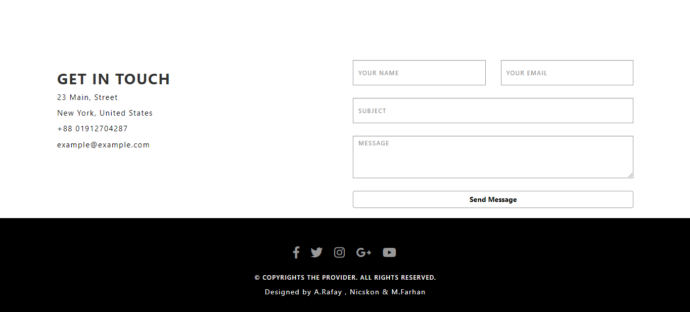
- Contact Forms6
- Responsive Footers8
- Javascript4
- Websites3
- Bootstrap Cards0
- Vanilla JavaScript1
- jQuery Effects0
- Bootstrap Sidebar Menus0
- CSS Sidebar Menus0
- Navigation Bars4
- Responsive Gallery3
- Responsive Feedback Page5
- Blog0