
Neon Snake Button Using HTML & CSS | Neon Light Button Animation Effects on Hover
Neon Snake Button Using HTML & CSS | Neon Light Button Animation Effects on Hover
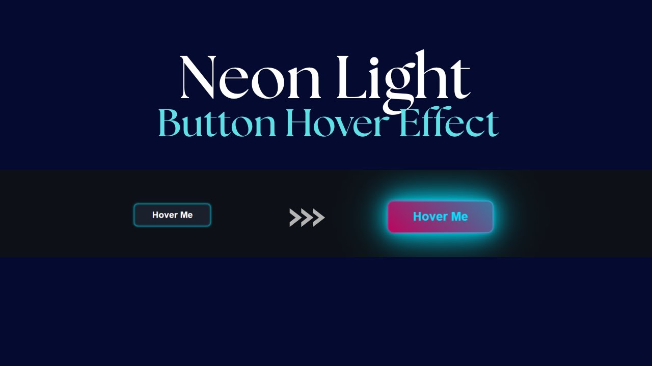
In this tutorial, we’ll create a stunning neon light button with a snake border animation effect using just HTML & CSS. The glowing neon style combined with a smooth hover effect gives the button a futuristic and eye-catching look, perfect for modern websites, landing pages, or creative portfolios.
This button animation is built purely with CSS transitions and keyframes—no JavaScript required. It’s lightweight, responsive, and easy to customize with your own colors and styles.
✨ Features of the Neon Snake Button
-
Glowing neon light effect
-
Snake border animation that moves smoothly on hover
-
Fully responsive and adaptable to any design
-
Built using only HTML & CSS (no external libraries)
-
Easy to customize (change glow color, speed, and size)
Let's Design a Neon Light Button with snake Border.
Write first HTML:
                                <!DOCTYPE html>
<html lang="en">

<head>
    <meta charset="UTF-8">
    <meta name="viewport" content="width=device-width, initial-scale=1.0">
    <title>Neon Snake Button Using HTML & CSS</title>
</head>

<body>

    <button class="neon-button">
        Hover Me
    </button>

</body>

</html>
Let's Write CSS:
                                <style>
        :root {
            --neon-color-1: #00e5ff;
            --neon-color-2: #ff0077;
            --button-bg: #1a202c;
            --button-text: #fff;
            --border-speed: 2s;
        }

        body {
            background-color: #0d1117;
            display: flex;
            justify-content: center;
            align-items: center;
            min-height: 100vh;
            overflow: hidden;
        }

        .neon-button {
            position: relative;
            padding: 1rem 3rem;
            font-size: 1.5rem;
            font-weight: 700;
            color: var(--button-text);
            background-color: var(--button-bg);
            border: none;
            border-radius: 10px;
            cursor: pointer;
            outline: none;
            z-index: 1;
            box-shadow: 0 0 5px var(--neon-color-1), inset 0 0 5px var(--neon-color-1);
            transition: all 0.5s cubic-bezier(0.23, 1 0.32, 1);
        }

        .neon-button::before {
            content: '';
            position: absolute;
            top: -2px;
            left: -2px;
            right: -2px;
            bottom: -2px;
            background: linear-gradient(45deg,
                    var(--neon-color-1),
                    var(--neon-color-2),
                    var(--neon-color-1),
                    var(--neon-color-2),
                );
            background-size: 400% 400%;
            border-radius: 12px;
            z-index: -1;
            opacity: 0;
            filter: blur(8px);
            transition: all 0.5s ease;
            animation: move-border var(--border-speed) linear infinite;
        }

        .neon-button::after {
            content: '';
            position: absolute;
            inset: -2px;
            background: linear-gradient(45deg,
                    var(--neon-color-1),
                    var(--neon-color-2),
                    var(--neon-color-1),
                    var(--neon-color-2));
            background-size: 400% 400%;
            border-radius: 12px;
            z-index: -1;
            opacity: 0;
            transition: all 0.5s ease;
            animation: move-border var(--border-speed) linear infinite reverse;
        }

        @keyframes move-border {
            0% {
                background-position: 0% 50%;
            }

            100% {
                background-position: 100% 50%;
            }
        }

        .neon-button:hover {
            color: var(--neon-color-1);
            box-shadow: 0 0 10px var(--neon-color-1),
                0 0 40px var(--neon-color-1),
                0 0 80px var(--neon-color-1);
            transform: scale(1.05);
        }

        .neon-button:hover::before,
        .neon-button:hover::after {
            opacity: 1;
        }

        .neon-button:hover::after {
            animation-play-state: running;
        }
    </style>
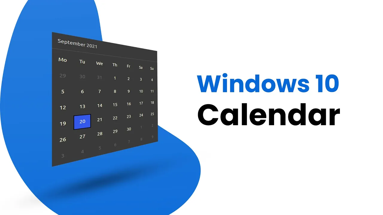
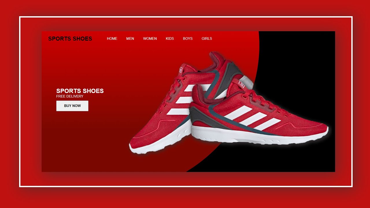
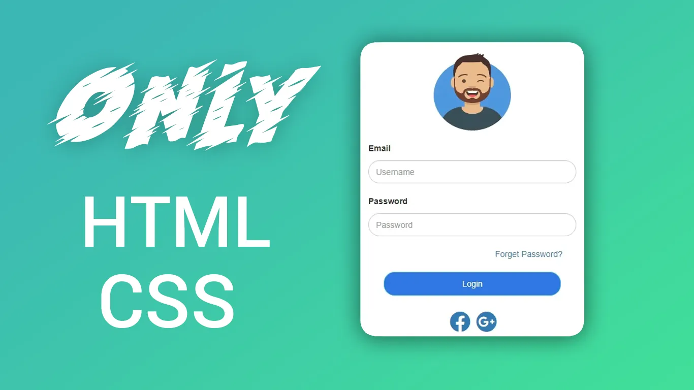
Recent Post

Most Popular Post


Categories
- HTML & CSS9
- Bootstrap4
- Login Forms11
- Sidebar Menu1
- Card Design1
- CSS Buttons3
- Social Media Buttons1
- Preloader or Loaders5
- Neumorphism Designs3
- Contact Forms6
- Responsive Footers8
- Javascript4
- Websites3
- Bootstrap Cards0
- Vanilla JavaScript1
- jQuery Effects0
- Bootstrap Sidebar Menus0
- CSS Sidebar Menus0
- Navigation Bars4
- Responsive Gallery3
- Responsive Feedback Page5
- Blog0