
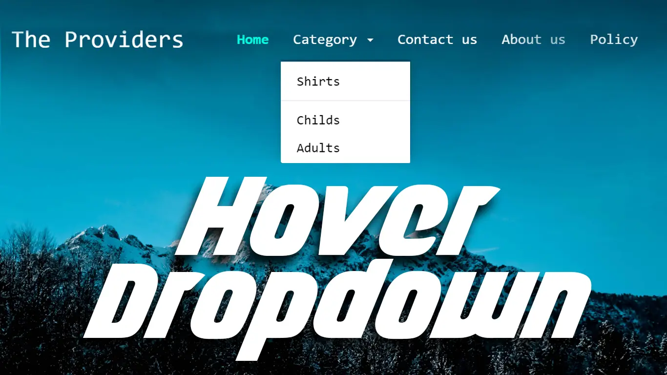
How to Create a Responsive Navbar | Navbar using HTML, CSS and Bootstrap 5
How to Create a Responsive Navbar | Navbar using HTML, CSS and Bootstrap 5
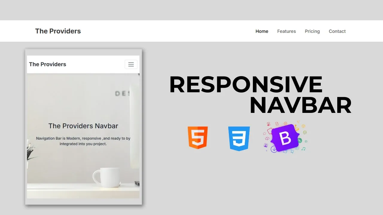
In this tutorial, you’ll learn how to create a responsive and mobile-friendly navbar using HTML, CSS, and Bootstrap 5. A navigation bar (navbar) is one of the most important elements of any website—it helps users move around easily and provides quick access to different pages.
With Bootstrap 5, building a responsive navbar becomes super easy. It comes with built-in classes and components that allow you to design a collapsible toggle menu (hamburger menu) for smaller screens and a full navigation menu for larger devices.
Features of the Navbar
-
Fully responsive navbar using Bootstrap 5
-
Toggle button (hamburger menu) for mobile screens
-
Clean and modern design with minimal code
-
Beginner-friendly and easy to customize
-
Works smoothly across all devices
What You’ll Learn
-
How to create a navigation bar using Bootstrap 5 components
-
How to add a brand/logo, navigation links, and toggle button
-
How to make the navbar collapse on small screens and expand on larger screens
-
How to style and customize the navbar for your project
By the end of this tutorial, you’ll have a fully functional responsive navbar that you can use in your website or projects.
Write HTML:
                                <!DOCTYPE html>
<html lang="en">

<head>
    <meta charset="UTF-8">
    <meta name="viewport" content="width=device-width, initial-scale=1.0">
    <title>Responsive Navbar with Hover</title>
    <link href="https://cdn.jsdelivr.net/npm/bootstrap@5.3.8/dist/css/bootstrap.min.css" rel="stylesheet" integrity="sha384-sRIl4kxILFvY47J16cr9ZwB07vP4J8+LH7qKQnuqkuIAvNWLzeN8tE5YBujZqJLB" crossorigin="anonymous">
<link href="https://fonts.googleapis.com/css2?family=Inter:wght@500;600;700;800;900&display=swap" rel="stylesheet">
</head>

<body>

    <nav class="navbar navbar-expand-lg navbar-custom sticky-top">
  <div class="container">
    <a class="navbar-brand" href="#">The Providers</a>
    <button class="navbar-toggler" type="button" data-bs-toggle="collapse" data-bs-target="#navbarNav" aria-controls="navbarNav" aria-expanded="false" aria-label="Toggle navigation">
      <span class="navbar-toggler-icon"></span>
    </button>
    <div class="collapse navbar-collapse justify-content-end" id="navbarNav">
      <ul class="navbar-nav gap-3">
        <li class="nav-item">
          <a class="nav-link nav-link-custom active" aria-current="page" href="#">Home</a>
        </li>
        <li class="nav-item">
          <a class="nav-link nav-link-custom" href="#">Features</a>
        </li>
        <li class="nav-item">
          <a class="nav-link nav-link-custom" href="#">Pricing</a>
        </li>
        <li class="nav-item">
          <a class="nav-link nav-link-custom " href="#">Contact</a>
        </li>
      </ul>
    </div>
  </div>
</nav>

    <div class="d-flex justify-content-center align-items-center main-section">
        <div class="container text-center mx-auto p-8 inner-div">
            <h1 class="text-3xl font-bold text-gray-800">The Providers Navbar</h1>
            <p class="text-gray-600 mt-4">Navigation Bar is Modern, responsive ,and ready to by integrated into you project.</p>
        </div>
    </div>


    <script src="https://cdn.jsdelivr.net/npm/bootstrap@5.3.8/dist/js/bootstrap.bundle.min.js" integrity="sha384-FKyoEForCGlyvwx9Hj09JcYn3nv7wiPVlz7YYwJrWVcXK/BmnVDxM+D2scQbITxI" crossorigin="anonymous"></script>

</body>

</html>
Let's Write some CSS.
                                <style>
    body{
        font-family: 'Inter' , sans-serif;
        background-color: #f7f9fc;
    }
    .main-section{
        width: 100%;
        height: 550px;
        background-image: url(image-banner.jpg);
        background-repeat: no-repeat;
        background-size: cover;
        background-position: center bottom;
    }
    .navbar-custom{
        background-color: #ffffff;
        border-bottom: 1px solid #e0e0e0;
        box-shadow: 0 4px 6px rgba(0, 0, 0, 0.05);
        padding: 1rem 0;
    }
    .navbar-brand{
        font-weight: 700;
        font-size: 1.5rem;
        color: #333;
        transition: all 0.3s ease;
    }
    .navbar-brand:hover{
        color: #4F46E5;
    }
    .nav-link-custom{
        font-weight: 500;
        color: #555;
        position: relative;
        transition: all 0.3s ease;
    }
    .nav-link-custom:hover{
        color: #4F46E5;
        transform: translateY(-2px);
    }
    .nav-link-custom::after{
        content: '';
        position: absolute;
        width: 0;
        height: 2px;
        bottom: -5px;
        left: 0;
        background-color: #4F46E5;
        transition: width 0.3s ease;
    }
    .nav-link-custom:hover::after{
        width: 100%;
    }
    .navbar-toggler{
        border: 1px solid #e0e0e0;
        padding: 0.25rem 0.75rem;
        font-size: 1.25rem;
        color: #555;
        transition: all 0.3s ease;
    }
    .navbar-toggler:focus{
        box-shadow: 0 0 0 0.25rem rgba(79,70,229,0.25);
    }
</style>
Recent Post


Most Popular Post


Categories
- HTML & CSS9
- Bootstrap4
- Login Forms11
- Sidebar Menu1
- Card Design1
- CSS Buttons3
- Social Media Buttons1
- Preloader or Loaders5
- Neumorphism Designs3
- Contact Forms6
- Responsive Footers8
- Javascript4
- Websites3
- Bootstrap Cards0
- Vanilla JavaScript1
- jQuery Effects0
- Bootstrap Sidebar Menus0
- CSS Sidebar Menus0
- Navigation Bars4
- Responsive Gallery3
- Responsive Feedback Page5
- Blog0